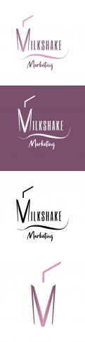
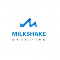
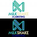
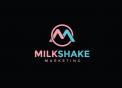
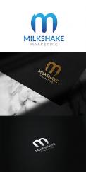
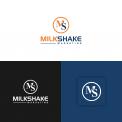
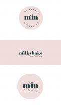
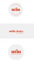
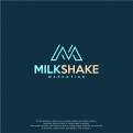
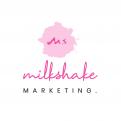
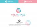
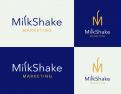
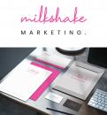
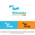
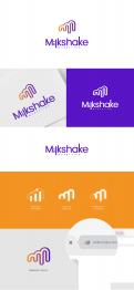
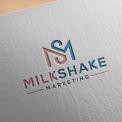
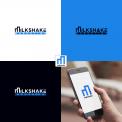
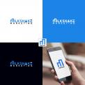
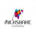
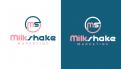
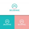
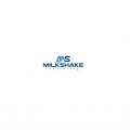
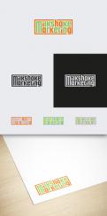
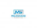
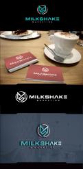
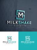
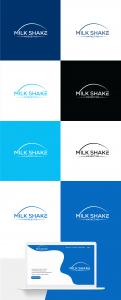
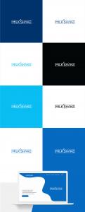
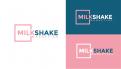
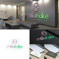
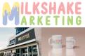
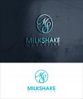
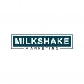
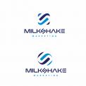
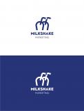
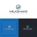
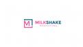
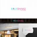
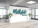
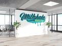
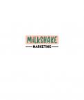
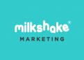
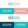
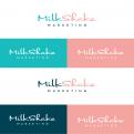
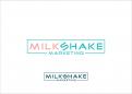
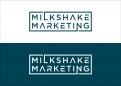
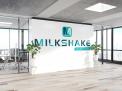
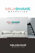
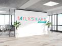
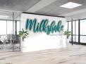
Wanted Nice logo for marketing agency Milkshake marketing
Contest details:
Bronze
- Contest holder: milkshakemarketing
- Category: Logo & stationery
- Total budget: € 359.00
- Start date : 28-08-2020 09:47
- Ending date : 02-09-2020 00:00
- Status : Ended
- Required formats: jpg,psd,ai
- Relevant files: None
-
Available languages:


- Number of designs: 175
-
Response rate:
low high
Needs:
We are an agency with a focus on brand strategy and content creation, especially aimed at little to middle large companies. We present ourselves with keywords such as: young, humor, expertise, no nonsense, to the point, customization, transparency, fast, proactive.
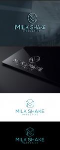
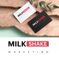
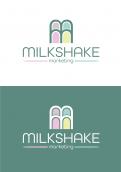
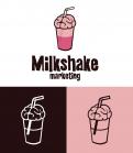
Not too many different colors in the logo, can be clean, may also be word mark. Colors are open to suggestion. Above all, it must also be useful in communications. we are in the process of setting up a website: www.milkshakemarketing.nl, but this clearly does not yet have the look and feel, in terms of text it already provides direction. we are waiting for the logo to be implemented on the website.
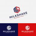
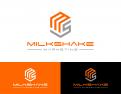
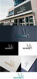
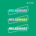
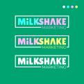
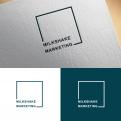
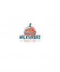
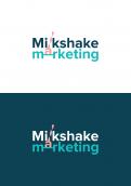
Update 30/8: We have now received 40 designs. three of them are preferred: from Kanaya, mihawk and katadesign, the 4 star designs. But all three are not exactly what we are looking for. So submitting is certainly worthwhile! Then think further than the colors that have been used so far, none of the colors are quite outstanding. Of the designs that are now available, we like that there is a creative thought (the skewed s, the design in which the letters continue in the frame, and the 'favicon'). What we're still missing is a really good font, so far either too technical or too standard. We still miss good colors, especially on a white or colored background, we will rarely use black background. Should not be too sweet, but should radiate professionalism. And importantly, it must be possible to make a good favicon, this is just as important as the word mark. Preferably a derivative of the word mark. And also nice if it is easy to use style elements, such as the lines in the design of mihawk.
Company description:
We are an agency with a focus on brand strategy and content creation, especially aimed at small to medium large companies. We present ourselves with keywords such as: young, humor, expertise, no nonsense, to the point, customization, transparency, fast, proactive.
We are located in the center of the Netherlands, but work throughout the country. We assume a standard approach: positioning, creating, managing. we work with a permanent team and also with a network of specialists (freelancers).
Target group:
small to medium large companies, all companies that want to grow but do not know how to approach this. For example, they now write a blog and do a post, but do not really understand which strategy to use and how to implement it. Companies that are too small for their own marketing department but are ready for that step.
Colors, favourites and other requirements
we were interested in a color scheme but now we've seen the examples of logos it's way too sweet, not suitable for a professional marketing company
-
designer: Margriet Pronk
-
designer: miniAZ
-
designer: Hillaryscott
-

designer: omhe19
-
designer: ZAHIR94
-
designer: envisiondesign
-
designer: ZAHIR94
-
designer: gauravgraphy
-
designer: ikiflores
-
designer: miniAZ
-
designer: ikiflores
-
designer: Artsenio
-
designer: trebdesign
-
designer: trebdesign
-
designer: Artsenio
-
designer: ikiflores
-
designer: sariaka
-

designer: puertouk
-
designer: FitriGunar
-
designer: FitriGunar
-
designer: EloyKruijntjens
-
designer: trebdesign
-
designer: trebdesign
-
designer: aquastudio
-
designer: aquastudio
-
designer: ikiflores
-
designer: nasikin
-
designer: ikiflores
-
designer: nasikin
-
designer: sariaka
-
designer: sariaka
-

designer: ismawan_7
-
designer: ismawan_7
-

designer: ismawan_7
-
designer: envisiondesign
-
designer: FitriGunar
-

designer: FitriGunar
-
designer: FitriGunar
-
designer: factor
-
designer: factor
-
designer: miniAZ
-
designer: miniAZ
-
designer: ZAHIR94
-
designer: CuriousCabbage
-
designer: miniAZ
-
designer: eltwe1112
-
designer: otreba
-
designer: 29design
-

designer: 29design
-
designer: LotteJosefine
-
designer: sariaka
-
designer: sariaka
-
designer: wisang_geni
-
designer: Honko
-
designer: Honko
-
designer: Honko
-

designer: Hillaryscott
-
designer: Hillaryscott
-
designer: ZAHIR94
-
designer: anak lanang
-
designer: anak lanang
-
designer: ovfa®
-
designer: Fabian1
-
designer: ovfa®
-
designer: ovfa®
-
designer: Davechenderson
-

designer: nandita2189
-
designer: miniAZ
-
designer: ludovic
-
designer: ZAHIR94
-
designer: BadalHossain
-
designer: dadan
-
designer: Agennceh
-
designer: Artsenio
-
designer: Remarij
-
designer: Remarij
-
designer: Artsenio
-
designer: Artsenio
-
designer: Y-graphic design
-
designer: Y-graphic design
-
designer: BadalHossain
-
designer: BadalHossain
-
designer: BadalHossain
-
designer: Artsenio
-
designer: Artsenio
-
designer: Artsenio
-
designer: Artsenio
-
designer: Artsenio
-
designer: Artsenio
-
designer: gauravgraphy
-
designer: SteSa
-
designer: SteSa
-
designer: KataDesign
-

designer: djamel02
-
designer: djamel02
-
designer: mal
-
designer: mal
-
designer: 29design
-
designer: 29design
-
designer: BadalHossain
-
designer: BadalHossain
-
designer: Honko
-
designer: Davechenderson
-
designer: Davechenderson
-

designer: Davechenderson
-
designer: Davechenderson
-
designer: Davechenderson
-
designer: Davechenderson
-

designer: Davechenderson
-
designer: Davechenderson
-
designer: Davechenderson
-
designer: Davechenderson
-
designer: Davechenderson
-
designer: stevan banjac
-
designer: KataDesign
-
designer: ZAHIR94
-
designer: 29design
-

designer: Yuzey
-

designer: mihawk
-

designer: mihawk
-
designer: sagara
-
designer: gauravgraphy
-
designer: 29design
-
designer: broiss
-
designer: broiss
-

designer: broiss
-
designer: otreba
-
designer: Brand_Star
-
designer: Brand_Star
-
designer: KataDesign
-
designer: stevan banjac
-
designer: kanaya
-
designer: kanaya
-
designer: KataDesign
-
designer: KataDesign
-
designer: BadalHossain
-
designer: albar
-
designer: motionflux
-
designer: motionflux
-
designer: motionflux
-
designer: motionflux
-
designer: motionflux
-
designer: motionflux
-
designer: albar
-
designer: albar
-
designer: ZAHIR94
-
designer: otreba
-
designer: ident Corp Branding
-
designer: Dansha
-
designer: ZAHIR94
-

designer: kiesjouwstijl
-
designer: MEHRU
-
designer: kanaya
-
designer: sujiman
-
designer: dnkdesign1
-
designer: ZAHIR94
-
designer: Cindyzign
-
designer: Cindyzign
-
designer: omhe19
-
designer: ident Corp Branding
-
designer: BadalHossain
-
designer: BadalHossain
-
designer: mihawk
-
designer: mihawk
-
designer: mihawk
-
designer: mihawk
-
designer: mihawk
-
designer: mihawk
-
designer: Cindyzign
-
designer: omhe19
-
designer: KataDesign
-
designer: Cindyzign
-
designer: Cindyzign
-

designer: Shirleybarbieur
-
designer: Cedric B
-
designer: krisi