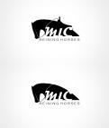
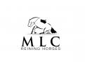
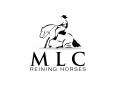
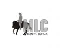
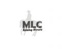
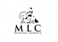
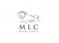
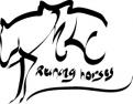
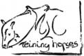
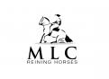
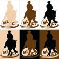
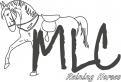
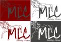
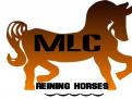
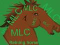
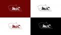
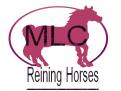
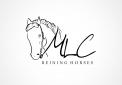
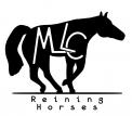
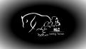
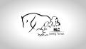
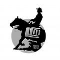
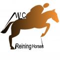
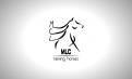
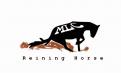
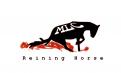
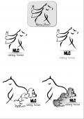
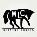
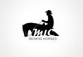
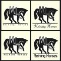
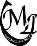
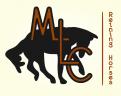
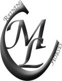
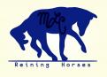
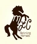
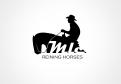
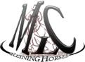
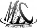
Logo for a Quarter Horses breeding for international Reining competition
Contest details:
- Contest holder: reining60
- Category: Logo design
- Total budget: € 225.00
- Start date : 15-04-2012 10:56
- Ending date : 22-04-2012 10:52
- Status : Ended
- Required formats: jpg,psd,pdf,ai
- Relevant files: None
-
Available languages:


- Number of designs: 62
-
Response rate:
low high
Needs:
Company description:
"MLC Reining Horses" is a breeding “Quarter Horses” for major international competitions of Reining. The most known American Riding discipline. The Reining is a sequence of compulsory figures such as "sliding stop" or "spin".
- http://en.wikipedia.org/wiki/Reining
Target group:
From crosses of the best current standards from the U.S, our foals are for the greatest competitors in order to enhance the discipline of French breeding. They are sold through European websites or simply via network. Currently the best reining riders in the world besides the U.S., are Belgian, Italian or German.
Colors, favourites and other requirements
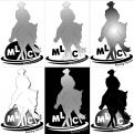
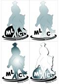
No brightly colours or American flag and at most 3 colours. The logo must be professional, luxury with refined motion and maybe the silhouette of a horse or rider. No photo. We must understand what it is about with three letters : Horses and Reining. The idea is to suggest movements that are the hallmark of the Reining. But beware, many others are using the "sliding stop" figure. The ideal would be to use the movement of the "spin", but I can imagine it will be difficult with letters as angular as the M and L. ... the idea is to embed them. Some examples below of logos that already exist but too many look alike .... so gather some info’s and let your creativity reign!
-
designer: sanne
-
designer: incognito designs
-

designer: incognito designs
-
designer: incognito designs
-
designer: igepe
-
designer: igepe
-
designer: sube
-
designer: sube
-
designer: incognito designs
-
designer: incognito designs
-
designer: maho
-
designer: maho
-
designer: incognito designs
-
designer: sube
-
designer: johanh
-
designer: johanh
-

designer: Nevena
-
designer: myriam
-
designer: Jayzone
-
designer: Jayzone
-
designer: Jayzone
-

designer: myriam
-
designer: myriam
-
designer: myriam
-
designer: sanne
-
designer: myriam
-
designer: soilakerzdesign
-
designer: tripsine
-
designer: sanne
-
designer: myriam
-
designer: myriam
-
designer: MarieAF
-
designer: MarieAF
-
designer: LD-Création
-
designer: myriam
-
designer: tripsine
-
designer: tripsine
-

designer: sanne
-
designer: ff2
-
designer: MarieAF
-

designer: MarieAF
-

designer: MarieAF
-
designer: MarieAF
-

designer: MarieAF
-
designer: vincent-rommelaere
-

designer: tripsine
-
designer: vincent-rommelaere
-
designer: MarieAF
-
designer: tripsine
-
designer: sanne
-
designer: tripsine
-
designer: maho
-

designer: maho
-
designer: tripsine
-
designer: maho
-
designer: tripsine
-
designer: tripsine
-
designer: sanne
-

designer: maho
-
designer: maho
-
designer: maho
-

designer: maho