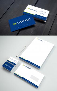
Corporate identity around for our existing logo
Contest details:
Gold
- Contest holder: t4changebv
- Category: Stationery design
- Total budget: € 519.00
- Start date : 25-09-2020 11:17
- Ending date : 09-10-2020 00:00
- Status : Ended
- Required formats: psd,ai
- Relevant files:
-
Available languages:


- Number of designs: 75
-
Response rate:
low high
Needs:
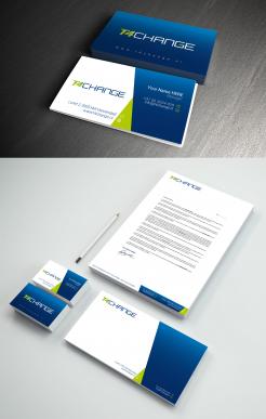
The logo with the color scheme will continue to exist for the time being and there is a need for context for this logo to strengthen the logo
Company description:
we are a ICT Value added reseller with a focus on the endpoint. https://www.t4change.com
Target group:
Colors, favourites and other requirements
free format
3 POINTS
-
-
No comments
-
This contest is finished. Its not possible to reply anymore.
-
-
-
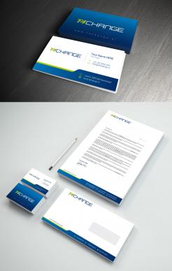
t4changebv says :
For now, this one is our favorite. It's fresh, clean and simple
-
3 POINTS says
Hi,
Do you want us to try a business card that mentions Twitter and LinkidIn? -
This contest is finished. Its not possible to reply anymore.
-
-
-
No comments
-
This contest is finished. Its not possible to reply anymore.
-
-
-
t4changebv says :
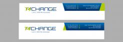
at the bottom is better
-
This contest is finished. Its not possible to reply anymore.
-
-
-
t4changebv says :
at the bottom is better
-
3 POINTS says
I also think, I prefer the bottom one
-
This contest is finished. Its not possible to reply anymore.
-
-
-
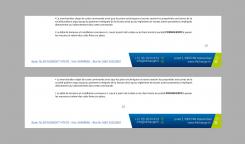
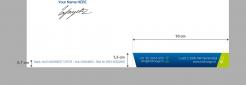
t4changebv says :
your advise is: pagenumber above the adress?
-
t4changebv says :
also very curious what your vision is on the powerpoint bit
-
3 POINTS says
Yes 2.5cm from the bottom or 1cm above the address should be good
-
3 POINTS says
You can program a layout with a margin that you want on all software (Word, Excel, Powerpoint ...).
-
t4changebv says :
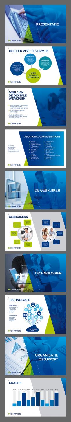
i fully understand that but part of corporate identity is to create a powerpoint slidedeck with several template pages for uniform presentation.
-
t4changebv says :
as an example i included a general deck we are currently using
-
3 POINTS says
Hello,
I haven't received anything as an example of a powerpoint presentation, if you want to send it directly by e-mail, otherwise I start working on it, but seeing the contents of your general powerpoint deck could help me enormously
Thank you -
t4changebv says :
It's one of the files attached to this contest
-
This contest is finished. Its not possible to reply anymore.
-
-
-
No comments
-
This contest is finished. Its not possible to reply anymore.
-
-
-
3 POINTS says
Hello,
I thank you for the interest brought to my work, if you have any remarks or suggestions do not hesitate to let me know
cordially -
t4changebv says :
I really like this one, but on a practical note, how to deal with reports and page numbering? Is the letter identity also meant for word docs and reporting purposes?
-
t4changebv says :
I really like this one, but on a practical note, how to deal with reports and page numbering? Is the letter identity also meant for word docs and reporting purposes?
-
t4changebv says :
I really like this one, but on a practical note, how to deal with reports and page numbering? Is the letter identity also meant for word docs and reporting purposes?
-
t4changebv says :
I really like this one, but on a practical note, how to deal with reports and page numbering? Is the letter identity also meant for word docs and reporting purposes?
-
3 POINTS says
Hello,
Thank you for your feedback, for the pagination normally there is enough margin for that in the middle, and for Word documents there is certainly no problem, you just have to do a layout on Word, otherwise you will have a another option that can dissolve your fears, I'm sending this to you. -
t4changebv says :
same problem? refresh of the page was not initiated?
-
t4changebv says :
one of the remarks from one of my colleague was; would it be possible to make the gradient bit a tiny bit darker. I think he means that gradient light blue bit starts a bit darker and becomes solid..
-
This contest is finished. Its not possible to reply anymore.
-
-
-
No comments
-
This contest is finished. Its not possible to reply anymore.
-
-
-
No comments
-
This contest is finished. Its not possible to reply anymore.
-