Een logo en webpagina design
Contest details:


Needs:
Company description:
A young fresh label that stands for original, contemporary products with a message.
Target group:
Colors, favourites and other requirements
glasscage
-
-
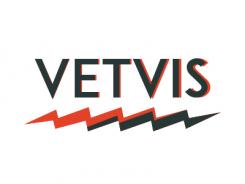
Description by designer glasscage:
Another take on retro style, I would love to hear your opinion!
-
This contest is finished. Its not possible to reply anymore.
-
-
-
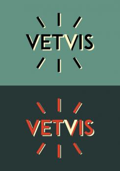
Description by designer glasscage:
Hello, and thanks for your feedback! I experimented more with the retro style.
Do you have some pictures of your products, or could you point to some other products that have a similar "feel" to yours? I think that would help a lot. I understand that you make new, unique things out of found materials, but to see specific examples of your products would help to really understand your style. The susanbijl.nl logo is all about their products. -
pas.fritz says :
You're right! I fought that I putted my pictures also on the English version of my Brandsupply-page. Maybe now you'll understand our style better. Your logo's are to old fashioned. On the pictures you could see the logo we'd made ourselves. We would like a surprising something in the logo.
Grt Pascalle -
This contest is finished. Its not possible to reply anymore.
-
-
-
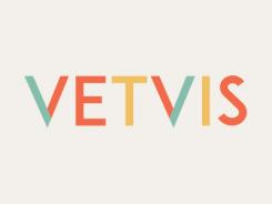
Description by designer glasscage:
I used different colors to convey the retro feel, but trying to keep the designs contemporary. Let me know if I'm heading in the right direction!
-
pas.fritz says :
We like the design, but we miss something. It's maybe to colorful. We think the lettertype is nice.
-
This contest is finished. Its not possible to reply anymore.
-
-
-
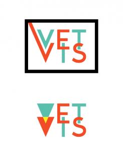
Description by designer glasscage:
Hello! I tried to create something visually distinct, yet still simple. I tried to convey the retro feel through the geometric type and bright, contrasting colors.
I would love to hear your thoughts and opinion. -
This contest is finished. Its not possible to reply anymore.
-