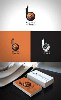
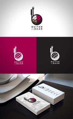
Trendy Hip Fresh logo for restaurant on a golfcourse
Contest details:
- Contest holder: Anneloes
- Category: Logo & stationery
- Total budget: € 200.00
- Start date : 04-10-2016 09:08
- Ending date : 17-10-2016 12:41
- Status : Ended
- Required formats: jpg,ai
- Relevant files: None
-
Available languages:

- Number of designs: 68
-
Response rate:
low high
Needs:
Choice of colour: free
Design a strong logo, for a restaurant on a golfcourse, it needs to appeal to golfplaying people: "after we play 18 holes we're going to eat and drink here". But it also needs to appeal to the local people in the area who do not play golf. We want them to come over and have a bite to eat and feel at home.
The logo will also be used on wine glasses, coasters, napkins, aprons and so on.
The logo needs to consist of name and a sign. The sign you can use without the brandname and people will stil be able to tell it's you.
Company description:
Target group:
Colors, favourites and other requirements
neca
-
-
No comments
-
This contest is finished. Its not possible to reply anymore.
-
-
-
No comments
-
This contest is finished. Its not possible to reply anymore.
-
-
-
No comments
-
This contest is finished. Its not possible to reply anymore.
-
-
-
No comments
-
This contest is finished. Its not possible to reply anymore.
-
-
-
neca says
Here is another variant with some minor changes. I thought maybe you'd like a bit more color added. Also, the "i" is now a fork to make it a bit more obvious that it's a restaurant logo. These are small changes, but I try to keep it subtle, simple and elegant, without adding too many unnecessary elements.
Any feedback would be much appreciated.
It would be really helpful to know if I am on the right track in terms of the direction and style in which you envisioned your logo.
Regards,
neca
-
Anneloes says :
Hi, thmaks for another design, truth be told: I like your first 2 desigs the most. If you would like to try something with colour, can you do something with the background? So i can envision how it looks when it's on red paper or any other bright colour. Please don't use green. I just learned through this contest i don't like green :-)
Thank you! -
This contest is finished. Its not possible to reply anymore.
-
-
-
No comments
-
This contest is finished. Its not possible to reply anymore.
-
-
-
No comments
-
This contest is finished. Its not possible to reply anymore.
-

