New Motorcycleclothing brand in desperate search of coolest logo in human history
Contest details:
- Contest holder: Roguestreetgear
- Category: Logo & stationery
- Total budget: € 100.00
- Start date : 06-05-2012 15:03
- Ending date : 19-05-2012 15:01
- Status : Ended
- Relevant files: None
-
Available languages:

- Number of designs: 34
-
Response rate:
low high
Needs:
Company description:
Target group:
Colors, favourites and other requirements
Mooiniet
-
-
Description by designer Mooiniet:
Hello Rebels,
Thanx for the positive feedback!
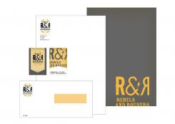
Hereby two new uploads. One with the stationairy (front and back) and the enveloppe.
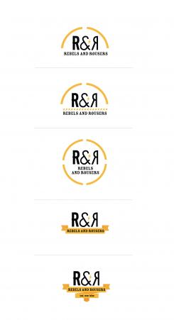
The other upload is a set of more widened versions of the logo, for the back of the jacket. I didn't use the shading behind the monogram. For some reason this seemed logical, but I can always put it back if you prefer, in the version you pick.
Hope to hear from you.
Greetings!
Jorina - mooiniet
www.mooinietontwerp.nl -
Mooiniet says
Hi Rebels,
It's been a bit quiet and the competition ends tomorrow. Is there anything I can do/change before
that time?
Let me know!
Jorina - mooiniet -
This contest is finished. Its not possible to reply anymore.
-
-
-
No comments
-
This contest is finished. Its not possible to reply anymore.
-
-
-
Description by designer Mooiniet:
Hello Rebels,
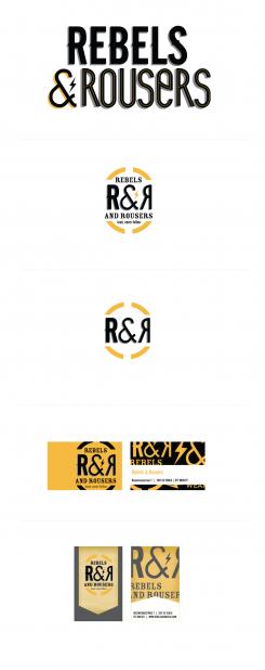
Hereby I submit my design. I made a modern logo proposal and a proposal that is a little more vintage (the second sketchbetween the yellow arches). The third is a monogram/pushbutton, more simplified, usable in combination with both logo's.
I included two different sketches for the bussinescard to give you an idea of how the identity could look.
The first is mainly vectorbased, the second has a slightly more vintage feel due to the background.
Let me know what you think! If you like it, I'll work out some proposals for the rest of the identity.
Regards,
Jorina - mooiniet
info@mooinietontwerp.nl -
Roguestreetgear says :
Dear Jorina,
We think you did a splendid job. Our opinion: We are not fond of the upper logo/ name-style, however we love how you combined this in the two logo's. The pushbutton logo (the 2nd) is very usable stylish but simple. That's good. The first logo is also a nice combination of different fonts, a nice lightning bolt and we like the arches. When looking at the business cards we prefer the last one. We also like the first business card, however the front side, with the name on it, is maybe a bit to cluttered. So we like what you did.
However one small comment. We also want to use the logo on the jackets as embroidery. The logo that you designer is higher then it is wide. This is no problem if you want to embroider it on the chest, on one side of a pants, but it is more difficult to use as a backpiece on a jacket. This would look like a big egg embroidered on the back. Thus, is it possible to add one variant, in the same style, that is easier to use on the back of the jacket? Then we could use this logo on the front and pants and use the extra logo on the back.
Good luck! You did very well!
Bedankt voor het enthousiasme waarmee je dit hebt opgepakt. We bekijken je website ook even.
-
This contest is finished. Its not possible to reply anymore.
-


