logo & stationary for new trading company - The 'Kate Moss' on Trading
Contest details:
Silver
- Contest holder: monique.willemse@nrg30.nl
- Category: Logo & stationery
- Total budget: € 349.00
- Start date : 26-03-2013 14:30
- Ending date : 09-04-2013 14:07
- Status : Ended
- Required formats: jpg,psd,ai,pdf, eps
- Relevant files: None
-
Available languages:


- Number of designs: 66
-
Response rate:
low high
Needs:
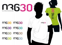
The image will be used (even stand alone) on t-shirts and on spcialist websites, recognisable as NRG30 websites. These can have words like: Powered by NRG30, or NRG30-club.
Besides stationary we will use logo on web and for (online) marketing campaigns, incl social media.
Company description:
NRG30 (enery three zero) is the company of 2 business friends, sharing their passion for marketing and sales.. We search (and afterwards sell) products that have no representation in the Belenux. NRG30 is distributor, wholesale org and retailer. All are products are fun funky and fasionable. they also add to personal appeal and show quality. NRG30 has the intention to become the Kate Moss of trade: always on top of things, though slithgly different, rebellious compared to others. NRG30 strives for customer focus and customer friendlyness
Target group:
the young at heart!
Colors, favourites and other requirements
Colours and designs, fonts should take into account screen and print. And the fact that we need to be able to work from any device from anywhere in the world
Surprise us on business cards, maybe somthing generic that needs additions in pen by the one handing it out?
All should be usable in Word, Excel, webshop. SAAS software.
We like simple but catchy designs
examples:
http://www.dearkates.com/
http://www.manpacks.com/
http://www.vente-exclusive.com/nl-NL
http://annstreetstudio.com/category/cinemagraphs/
design.emg
-
-
monique.willemse@nrg30.nl says :
Hi, thx for the effort. We agree that the former G was better - we;ve decided on another design. We value your creativity. Thx!
-
This contest is finished. Its not possible to reply anymore.
-
-
-
No comments
-
This contest is finished. Its not possible to reply anymore.
-
-
-
monique.willemse@nrg30.nl says :
Pls adjust tagline in fun, funky & fabulous. We're not too sure whether black & pink is trendy/exciting enough. Further, the 9 actually looks like nine...so it reads N(something) 930. The actually could be a bit more recognisable. ( a double check woth our friends showed that they could not all read it "-))
-
design.emg says
Actually it was my intention to confuse people with the sign. cause thats what people makes recognize and questioning things. especially in fashion business. its my recommendation BUT its your Logo so maybe we could try to put the "9" down like a little "g". Out of the context. With the color – its no problem to change it in any way ...maybe the added value is that it has no defined color ...it could change on for what it is needed. It was just an idea. If you dont like it... I can do any color. Im out of office till 2 of april – then i am going change it to your representations. regards
-
monique.willemse@nrg30.nl says :
Hi you're in our top 3. we're looking forward to your adjustments and maybe your vision on the other items for stationary.
-
This contest is finished. Its not possible to reply anymore.
-
-
-
monique.willemse@nrg30.nl says :
Design.emg.....waarom roze?
-
monique.willemse@nrg30.nl says :
wil je dit eens laten zien met fun funky & fashionable eronder (als het past)
-
monique.willemse@nrg30.nl says :
ooo, sorry - just realized you're not Dutch. Can you explain why you picked Pink? And can you show this maybe with the words fun, funky & fashionable instead of powered by.....? THX!
-
design.emg says
Hi, your right my duch isnt very impressive:)
Magenta is a colour that fits to most of other colours and give them a modern touch. Its conspicuous, bright and recognizable. Even more its perfect in producing process. Because its a pure colour and not mixed of others you can be sure that its easy to handle for perfect print results. I will modify it for you. regards -
This contest is finished. Its not possible to reply anymore.
-


