logo and identity for a sme of pharmaceutical products
Contest details:
- Contest holder: ular
- Category: Logo & stationery
- Total budget: € 150.00
- Start date : 21-10-2020 13:27
- Ending date : 04-11-2020 13:26
- Status : Ended
- Relevant files: None
-
Available languages:


- Number of designs: 148
-
Response rate:
low high
Needs:
we need a logo for the company "Société Pharmaceutique de Yaoundé" abbreviated "PHAYA"
this is a new company that will manufacture pharmaceutical products (physiological serum, concentrates, dialyzers and other dialysis consumables). as its name indicates the company will be located in Yaoundé in Cameroon the abbreviation PHAYA refers to the English word "Fire" which means fire so the logo will revolve around the rebirth in fire and pharmacy.
we do not have a preference in terms of color but the style must be modern and timeless.
Regarding the paper in mind we would like it to bears some design of the products manufactured by the companies.
thanks
Company description:
Target group:
Colors, favourites and other requirements
Nardjis
-
-
Description by designer Nardjis:
Bonjour Monsieur,
Please find attached another version of the previous submitted logo.
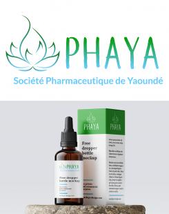
This time, I choose more bright colors to highlight the medical aspect of your compagny
I hope this set of colors also pleases you.
In hope to have the oportunity to work with you.
Bien à vous,
Nardjis -
This contest is finished. Its not possible to reply anymore.
-
-
-
Description by designer Nardjis:
Bonjour Monsieur,
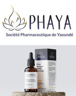
Please find attached the submitted logo and an example of its use.
This logo revolves around the themes "rebirth in fire" and "pharmacy" thanks to the association of the icon and the typo used. The icon represents a powerful fire, shaped in a flower form, to symbolize rebirth, health and life. The hand-made typo used, filled with a black-to-blue gradient creates a living feeling and gives a modern aspect to the logo. The font used for the tagline creates a significant contrast and stabilitity.
I do hope this logo pleases you. Please, don't hesitate to send me your feedbacks and I will correct the needed elements.
In hope to have the oportunity to work with you.
Bien à vous,
Nardjis -
This contest is finished. Its not possible to reply anymore.
-


