Logo and corporate identity for a new, small-scale healthcare facility
Contest details:
Gold
- Contest holder: janluesink@mac.com
- Category: Logo & stationery
- Total budget: € 589.00
- Start date : 23-12-2016 12:36
- Ending date : 20-01-2017 00:00
- Status : Ended
- Relevant files: None
-
Available languages:


- Number of designs: 127
-
Response rate:
low high
Needs:
It will be used mainly to care reports and agreements but also in marketing communications. It will also have to be the basis for the site to be developed. We are looking for more than just a logo.We're looking for a logo and corporate identity that are recognizable. It will be used mainly to care reports and agreements but also in marketing communications. It will also have to be the basis for the site to be developed. We are looking for more than just a logo.
The health care organization focuses protected and sheltered housing. Children, adolescents and young adults who can no longer live at home with us find a place in a warm, small-scale residential setting. We work with small teams and have more climate of a family / family than a "care facility".
We focus on what is going well and want to strengthen it. In place of the focus on problems.
Company description:
The health care organization focuses protected and sheltered housing. Children, adolescents and young adults who can no longer live at home with us find a place in a warm, small-scale residential setting. We work with small teams and have more climate of a family / family than a "care facility".
We focus on what is going well and want to strengthen it. So we want not the problems be our main focus.
The health care organization now has the following activities:
1) Family home where four children live. The family home parents catch these children in their own families. The children often have complex problems. In addition to the warmth of the family, the family home parents are so professional educators.
2) Family Group where up to six children live. The leadership of the group consists of a small team (3 people) who live at least four days a week on the group (per teammember). Children / young adults working on recovery. The goal is transition to home, family home or live independently.
3) Trasition to Indipendent Living
For young people who live independently, we have some independent living. The youths live here independently with supervision (control).
Target group:
Children with (multiple) problems
Youth
Young adults
Colors, favourites and other requirements
- PDF A4 letter main page and following pages
- businesscard which can be changed for new personal
- logo. When in color, also a mono color version
- design items like bullets, lines, logo parts, etc for use in presentations and other marketing materials
Richie
-
-
Description by designer Richie:
Hey there,
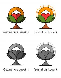
This is a different approach to the same idea I sent you yesterday. This one has more depth and brighter colors. I also used bold lines which stands for stability and profesionalism.
Let me know if you like the direction in which I am going.
Hristo -
This contest is finished. Its not possible to reply anymore.
-
-
-
Description by designer Richie:
Hey,
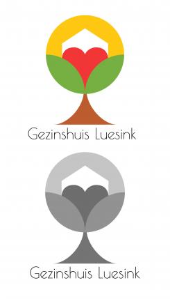
Here is another idea for the logo. It is a totally different approach but I hope you like it. I kept the heart and the house, but i used only 1 heart, so it doesn't get too crowded with hearts :)
The sun and the heart symbolize the warmth and the love. The tree is the growth of your company as you mentioned that now it is becomming bigger and that is why you change the name. And the house symbolises the home you are offering to the people in need.
Green again is hope and growth. Red is love. Yellow is warmth and brown is reliability and security,because you want to be percieved as a secure company by your clients.
The style is very minimalistic and simple, so it is memorable and easy to use in big and small size. It doesn't have too many details, so it is easy for the eye and the colors work well together.
Please tell me what do you think.
Thanks,
Hristo -
This contest is finished. Its not possible to reply anymore.
-
-
-
Description by designer Richie:
Hey there,
My name is Hristo.
I hope you enjoy my design.
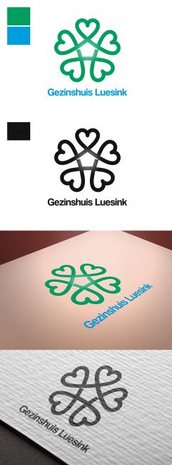
I used the heart like a symbol of love and hope. I put 5 interconnected hearts so there is the sence of family and community, that nobody is alone.
Also in the middle of the 5 hearts there is a shape of a house, so that again we remind people that Gezinshuis Luesink is about feeling at home.
I used green and blue, because they mean hope and dreams. The colours can be changed if you have something in mind.
Please let me know what do you think.
All the best,
Hristo -
janluesink@mac.com says :
Hi Hristo,
Thanx for your design. I like it. Although there is a lot of hearts. Maybe a little bit to much. Maybe you can make the hearts les obvious? -
Richie says
Hey Jan,
I will do my best. Do you like the direction of the idea? -
This contest is finished. Its not possible to reply anymore.
-


