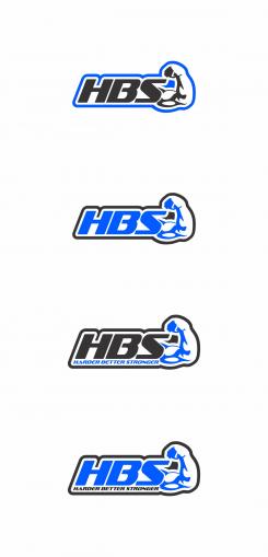
H B S Harder Better Stronger - Bodybuilding equipment
Contest details:
Silver
- Contest holder: fitnessdistribution
- Category: Logo & stationery
- Total budget: € 419.00
- Start date : 06-08-2016 12:43
- Ending date : 13-08-2016 12:43
- Status : Ended
- Required formats: jpg,psd,ai,
- Relevant files: None
-
Available languages:


- Number of designs: 168
-
Response rate:
low high
Needs:
Our target is predominantly male athletes (80%), people who already practice this discipline, and who want to be autonomous and have their own equipment at home.
The gym club has many downsides: you have to go there, to have time, hope that the machines (often fewer than those for cardio / treadmills etc.) are available etc. Also, weight training can be practiced almost on a daily basis and for short periods (30 minutes), so go to the gym would be very time consuming.
Finally, our machines are highly versatile, compact and allow working almost every muscle group in a small space at home.
HBS, Harder Better Stronger, is a new range of products, which are similar to those existing as POWERTEC, BODYSOLID, MEGATEC. We want to improve the ergonomics of our machines to use more efficient and less burdensome on the joints.
We are seeking a logo and a graphic style useable on all our marketing and website. The colors are glossy black, matte blue, and chrome (silver gray depending on the media). These are the three colors of our machines.
The blue is not yet validated, we welcome your suggestions. A preference for blue Electric RGB 44,117,255 or azure RGB 0191255
We want a logo and the 3 letters of the brand H B S. Depending on the shape and layout of the logo we can add the meaning of the letters: Harder, Better, Stronger
The logo should include the three colors to be easily recognizable. It must also be able to embroider on our leather benches. So not too complex. Ideally it should convey the strength and robustness. It must be identifiable by a bodybuilder. Also he should want to be identified with this logo and wear it on his T-Shirt for example.
Attached you will see a machine of a competitor, which is close to our best seller. Our machines will be black, blue and chrome.
Company description:
Target group:
Colors, favourites and other requirements
Misa84
-
-
Description by designer Misa84:
Dear fitnessdistribution,
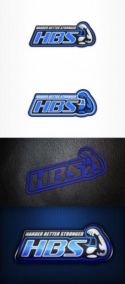
First two are for printing, I add a white stroke to letters and now letters are more standing out,colors are black, two grays(two look more like silver color)and electric blue, i think that now looks more strong and things are more pointing up, the second is another solution where i try to blue be more dominant color,there i needed to add a another stroke,about embroided version i try to make it realistic so this is best i can get, but i think it will look more better when its actualy sewn especially with flashy blue thread, and last one i add is glossy metalic look, it can be used on web or like metal plates for equipment even as a badge.I hope you like it.
Best Regards,
Misa84 -
This contest is finished. Its not possible to reply anymore.
-
-
-
Description by designer Misa84:
Dear,
This is embroided version when the logo is inverted, so the black leather itself will give the letters and arm the shadow,i think its better when it is sewed like this.
regards
Misa84 -
This contest is finished. Its not possible to reply anymore.
-
-
-
Description by designer Misa84:
Dear,
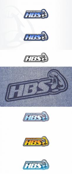
I modify arm,think its more visible now, there is more variations of colors and i try approximately to make how whould it look like when its sewn.
Regards Misa84 -
fitnessdistribution says :
thanks... so far the best one. Good job
could you please keep this version, and do a few things:
1) for the embroided version, please use black leather background, and nice flashy electric blue thread
2) Printed version. I do not like how u put the colors, because it looks faded. Please make one version with black, blue and silver combination, but as a STRONG logo. A bit like the yellow one, but in blue and even stronger. 100% fill, put light effects, volume/3D....
thanks a lot.
For the embroided, no text.
For the print, text on top as you did is nice.
Arm and hand are nice too -
This contest is finished. Its not possible to reply anymore.
-
-
-
No comments
-
This contest is finished. Its not possible to reply anymore.
-
-
-
No comments
-
This contest is finished. Its not possible to reply anymore.
-
-
-
fitnessdistribution says :
hi, looks nice, thanks.
could you please make one version in only 2 colours on white background, no gradients. This is for the sewing on the bench. I want to check if no technical problems. Thank you. -
fitnessdistribution says :
and one without the Harder Better Stronger please. I do not think we can sew the text
-
Misa84 says
Dear fitnessdistribution,
Thank you for reply and rating, i'll post new designs with your suggesstions during the day.
Thanks, Mik184
-
fitnessdistribution says :
Dear
thank you for the new entry. This should work.
However, we have shown the logo to several people, and one comment that is often made is that the arm is not always well recognized, if put outside of the bodybuilding setting....
it seems the hand of the logo is not recognzible enough and makes the arm look 'strange'...
not sure exactly what to change, but please have a close look and see what you can do.
also, in terms how to place the different colours, give it some other tries. I am not sure it is the arm that should be blue. black would fit better, as it needs to be really strong
try to work a bit on the 3 letters in terms of surface, different colour variation, shades, gradients, 3D, or whatever you master and believe would fit.
thank you for the great work -
Misa84 says
Dear fitnessdistribution,
Yes I understand, the arm is actualy made of shadows of muscles thats why is most visible in the dark colors, i agree that is not recognizible in bright colors like blue you want, I try to modify it to look more visible.
thank you, Misa 84 -
This contest is finished. Its not possible to reply anymore.
-

