design logo and house style for niche consultancy start-up
Contest details:
Bronze
- Contest holder: Aute
- Category: Logo & stationery
- Total budget: € 359.00
- Start date : 13-11-2017 11:31
- Ending date : 27-11-2017 00:00
- Status : Ended
- Relevant files: None
-
Available languages:


- Number of designs: 102
-
Response rate:
low high
Needs:
The ambition is to grow within a few years into a network-enabler, the world-wide focal point for knowledge and insight in the area of supervision strategy.
Keywords: customised work (see attached pic, that I use for my website), broad perspective, modern, knowledgeable and reliable. I am looking to strike a balance: on the one hand, the target audience (government regulators, supervisors) is quite conservative, so I do not want to use an extremely hip or young design. On the other hand, the ambition is to add modern insights to their work, so it cannot be too boring or old fashioned either.
See for my current website: supervisionstrategy.com. Would be good to have (one of) these colours in the design.
Note: this enterprise distinguishes itself from other consultants, because it is focused solely on regulation and supervision. It distinguishes itself from other regulation and supervision consultants, because:
- it only works for regulators (serving the public interest), not for commercial (regulated) companies;
- It combines 20 years of experience in supervision practice with a broad and deep knowledge base (law, philosophy, MBA, PhD);
- it is not limited to a technical perspective, but combines many perspectives on the 'regulatory craft'.
Note 2: given the brand name, Supervision Strategy, obviously avoid the abbreviation 'SS'. :)
Many thanks for your proposal!
Company description:
Target group:
Colors, favourites and other requirements
solaram
-
-
solaram says
hi Aute,
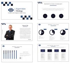
here's a (very) quick ppt mock up as i just read your comment and didn't have much time to really detail it before the end of the contest, anyway it's just to help you visualize the general design, hope you like it ;)
best regards,
Sol. -
This contest is finished. Its not possible to reply anymore.
-
-
-
solaram says
Hi Aute,
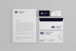
Here's a new version of the stationery mock up i hope the image will be better this time, i downsized the logos to match your request and i changed the dark blue background of the business card for a clear grey one with a chessboard pattern to reinforce the "strategy" feeling.
Best regards,
Sol.
-
Aute says :
Thanks Sol, image quality is fine. I love the chessboard pattern, well done! :)
I think the logo-and-letters could still be smaller (except for on the frontside of the business card).
My only, final worry (detail, detail)is that my website provider (Wix) might not support the font that you have chosen. Do you happen to know wether they do? Or else, what is a good way to make sure that I will have a consistent or at least 'compatible' font for the large lettering on my site? -
solaram says
Hi Aute,
to my experience Wix should have no problem with the font as it accepts .otf and .ttf font files just fine you just need to add it the font list, however i would advise against using the same font as the logo in the main body (text) of the website as it will create a monotony, i would instead advice using a sans serif font (like the one you were previously using or another one like that) to create contrast between titles and text -
Aute says :
Good to know, makes sense Sol, thanks.
-
Aute says :
Oh, I forgot, sorry: would you please visualise how a Powerpoint sheet could/should look like? Final request Sol, I promise. :) Many thanks, Aute
-
This contest is finished. Its not possible to reply anymore.
-
-
-
solaram says
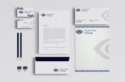
mock up of possible stationery design using the logo
-
solaram says
sorry it seems that the image quality was little bit lost when i was trying to make the file size uploadable on brandsupply, i will retry later with a higher quality image
Best regards,
Sol. -
Aute says :
Thanks Sol, looking forward to that.
I know this is only a quick mock up, but for the definite design I prefer the logo to be a bit smaller(more subtle), except for on the business card. And for this design, I personally think the dark background does not work well. :) Best, Aute -
This contest is finished. Its not possible to reply anymore.
-
-
-
solaram says
Hi Aute,
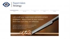
Here's a little mock up to help you visualize how it will look on your current website -
This contest is finished. Its not possible to reply anymore.
-
-
-
Aute says :
Thanks Sol, I prefer type 5: strong, simple, and the closeness of the letters give it a nice 'tight' feel.
-
This contest is finished. Its not possible to reply anymore.
-
-
-
solaram says
hi Aute,
here's the color combinations you asked, i also added some fonts that are similar, to the one i used in n°1 in the last proposal, i hope you like them, i can still propose some others after you chose what color combination you like, i think it will be easier to choose after that as the design will be near complete.
Best regards,
Sol. -
Aute says :
Hi Sol,
I prefer the colour scheme of 3. I think the logo is done. Also, the solution with the dividing vertical line between logo and letters works well, I think, as well as the blue and black letters with blue above.
Out of these options, I prefer the font of 1 because of the thickness of the lettering: the thicker 2 is a bit inelegant to me, and the thinner 3 a bit to insubstantial for a solid, reliable business partner.
Perhaps you would attempt some alternate fonts with about that thickness of 1, also 'professional/reliable,' yet a bit more distinctive/memorable? I know, it's a tough balance to strike!
Again, many thanks..
Aute -
solaram says
thanks Aute,
i will be back with a new selection of fonts that match your criteria as soon as i can.
Best regards.
Sol. -
This contest is finished. Its not possible to reply anymore.
-
-
-
solaram says
hi Aute,
thanks for the feedbacks, i'm glad to hear that you like the design, here's some color and fonts combinations for the previous design i ditched the gradient design for more solid colors to match the design of your website.
Best regards,
Sol -
Aute says :
Thanks, Sol. I will have a closer look when I have more time. I will get back to you on this shortly. Best, Aute
-
Aute says :
Hi Sol,
- for color scheme, I prefer a dark iris (more 'natural' looking), I think 5 is my favorite out of these, followed by 8. As I currently work with 3 colours (blue, orange/brown, and black), would you try two more options: dark blue eye with black iris, and black eye with dark blue iris? One of those should be it, I reckon.
- As for fonts, I think nr. 1 is my favorite out of these options, but I am not that convinced: ideally, I would want a font that says professional and reliable (as this one does), but that at the same time is a bit more recognisable (helps to build brand distinction)? -
This contest is finished. Its not possible to reply anymore.
-
-
-
Aute says :
Hi Sol, yes, I think this works really well, thanks. I think this is getting close to the final version of this design. I think the overall design is done, the only thing I would request is (i) some tinkering with letter type, color scheme etc, to see what works best, and (ii) visualising what this would look like in different applications (site, letterhead, etc)? I would like colours and lettertype to match my website. In terms of colours, I would like to stay close to the current website's colours (but happy to tweak them to match your design, if that works better). In terms of letter type: I think the type I currently use on the site (DIN Next Light) is a bit more distinctive and professional looking, but I am open to different types (as long as the website editor supports using this type). Best, Aute
-
This contest is finished. Its not possible to reply anymore.
-
-
-
solaram says
hi Aute,
thanks for you're feedback, here's a new proposal, i reused some ideas from the previous propasal while aiming for a more modern look, hope you like it :)
Best regards,
Sol
-
solaram says
sorry your*
-
Aute says :
Thanks Solaram, I like this much better in terms of look & feel. I think this solution, of using the chess piece as the iris of the eye, is quite creative. My main concern with this draft is that, when the logo is printed/projected in a small format, the horse will be unclear/hard to identify. Perhaps a different chess piece (tower, queen, king) might be easier to portray clearly in a small format?
-
This contest is finished. Its not possible to reply anymore.
-
-
-
Aute says :
To my personal taste, this is a bit traditional/stiffy. :) Also, I think I prefer some color (see website).
Thank you! -
This contest is finished. Its not possible to reply anymore.
-
-
-
Aute says :
I find the association that this image evokes not very clear. It seems like some puppet master pulling his strings? :) I don't think it does much for the brand.
-
This contest is finished. Its not possible to reply anymore.
-

