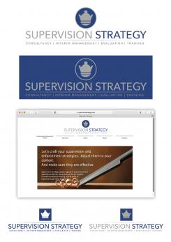
design logo and house style for niche consultancy start-up
Contest details:
Bronze
- Contest holder: Aute
- Category: Logo & stationery
- Total budget: € 359.00
- Start date : 13-11-2017 11:31
- Ending date : 27-11-2017 00:00
- Status : Ended
- Relevant files: None
-
Available languages:


- Number of designs: 102
-
Response rate:
low high
Needs:
The ambition is to grow within a few years into a network-enabler, the world-wide focal point for knowledge and insight in the area of supervision strategy.
Keywords: customised work (see attached pic, that I use for my website), broad perspective, modern, knowledgeable and reliable. I am looking to strike a balance: on the one hand, the target audience (government regulators, supervisors) is quite conservative, so I do not want to use an extremely hip or young design. On the other hand, the ambition is to add modern insights to their work, so it cannot be too boring or old fashioned either.
See for my current website: supervisionstrategy.com. Would be good to have (one of) these colours in the design.
Note: this enterprise distinguishes itself from other consultants, because it is focused solely on regulation and supervision. It distinguishes itself from other regulation and supervision consultants, because:
- it only works for regulators (serving the public interest), not for commercial (regulated) companies;
- It combines 20 years of experience in supervision practice with a broad and deep knowledge base (law, philosophy, MBA, PhD);
- it is not limited to a technical perspective, but combines many perspectives on the 'regulatory craft'.
Note 2: given the brand name, Supervision Strategy, obviously avoid the abbreviation 'SS'. :)
Many thanks for your proposal!
Company description:
Target group:
Colors, favourites and other requirements
Jerz
-
-
Description by designer Jerz:
Hello Aute,
A few lines to explain why and how I worked on the logo :
I chose not to incorporate the eye because for me this symbol is mostly used by opticians or any business related to eye condition.
As chess symbol, I preferred the Queen who is the most powerful piece in the game and can move fast in any direction unlike the others pawns.
I didn’t use the brown color in the logo to keep it simple and elegant.
I made a flat design logo, clean and efficient, you can use in a single color, particularly useful to print in B&W (for instance) and more readable (business card or small size documents).
If you like it and/or want some changes or have any question, I can work on it and then we can see for the stationery.
Have a good day !
Jerz -
Aute says :
Thanks Jerz! I feel this design is indeed nice and clean, but it is a bit too traditional for me. This is a fine balance (because indeed is must to be to hip and flashy), and personal preference thing, of course.. Thanks for the proposal though, I do appreciate it. Best, Aute
-
This contest is finished. Its not possible to reply anymore.
-

