Design a fresh logo and corporate identity for DDN Assuradeuren, a new player in the Netherlands
Contest details:
Silver
- Contest holder: josalma
- Category: Logo & stationery
- Total budget: € 459.00
- Start date : 06-05-2020 11:27
- Ending date : 13-05-2020 00:00
- Status : Ended
- Required formats: jpg,psd,ai,.eps
- Relevant files: None
-
Available languages:


- Number of designs: 128
-
Response rate:
low high
Needs:
Company description:
DDN Assuradeuren is a company that takes out insurance on behalf of insurers. Because we work nationally, DDN stands for Dwars Door Nederland (Straight Trough the Netherlands).
Mission:
We want to provide companies, entrepreneurs and individuals with a good night's sleep in a pleasant living environment and support them on their way to a carefree old age.
Vision:
Nobody wants to lie awake with the question whether everything is well insured. We unburden! We do this by standing next to our relations, literally. We know our customers, all of them. Sound advice and research into the insurance needs of our relations and good guidance in the event of damage is an essential part of this.
Core values:
- Sincerely involved with our clients
- Sincerely interested in what they do and need
- Straight forward, we don't beat around the bush
- Always fair, we tell it like it is and don't sugercoat it.
Target group:
- business insurance
- Entrepreneurs insurance
- private insurance
Colors, favourites and other requirements
Red, white, bleu, orange
RedRob
-
-
Description by designer RedRob:
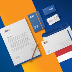
This is the stationery design alternative using the logo I suggest. Further details or adjusments can be discussed.
Regards,
Robby -
This contest is finished. Its not possible to reply anymore.
-
-
-
Description by designer RedRob:
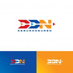
The logo offers a fresh yet solid impression in order to differentiate DDN from the others. The negative space suggests arrow shapes to represent guidance, straight forward and progressiveness. The typeface is bold and solid to symbolize trustworthy or bonafide. The colors are warm and fresh, to show the DDN intention to connect sincerely with their clients and bring a new different energy.
Regards,
Robby -
This contest is finished. Its not possible to reply anymore.
-


