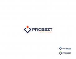
Company Name, Logo and Corporate Design for a real estate company
Contest details:
Silver
- Contest holder: c.probszt@remax-solutions.at
- Category: Logo & stationery
- Total budget: € 419.00
- Start date : 09-08-2016 22:23
- Ending date : 26-08-2016 22:20
- Status : Ended
- Required formats: jpg,ai
- Relevant files: None
-
Available languages:


- Number of designs: 145
-
Response rate:
low high
Needs:
My real estate company exists since 2014 and currently works mainly in the fields of brokerage of residential and commercial real estate. For both segments there is an existing Franchiseagreement with RE/MAX whereas the brands RE/MAX and RE/MAX Commercial are used. The office ad-on "Solutions" is used to distinguish between other offices.
We also extended our services by VAluation / Consulting where we have some strong USPs, but do not have to do something with RE/MAX and that should remain like this. In this segments the services are valuation, location- and market analysis, project positioning and other consultative services.
In the near future two more departments should be established:
1) Property Management
2) Asset Management
Especially the dept. Asset Management with is the supreme discipline, requires an absolute serious and trustful appearance. Thereis the idea to encouple the dept. Asset Management from the others.
Additional requirements:
- there should be one umbrella brand with can be mutated easiliy for each dept.
- the umbrella brand can work with my familiy name "PROBSZT" but do not need to
- as the words "Immo", "Immobilien" resp. "Property" are reather negativ understood, I would prefer not to use that words
If there are any further questions, please do not hesitate to contact me
Company description:
Target group:
Colors, favourites and other requirements
Bewoulf
-
-
No comments
-
This contest is finished. Its not possible to reply anymore.
-
-
-
Description by designer Bewoulf:
New concept
-
This contest is finished. Its not possible to reply anymore.
-
-
-
Description by designer Bewoulf:
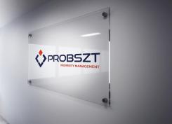
It will be perfect for plexiglass ads.
Here is the example.
Thank you -
c.probszt@remax-solutions.at says :
great
-
This contest is finished. Its not possible to reply anymore.
-
-
-
Description by designer Bewoulf:
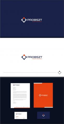
Stationery design
-
c.probszt@remax-solutions.at says :
What is that?
-
Bewoulf says
Hello there, I'm sure you will be doing well with the contest here.
Worked on a very upscale and clean concept, which clearly encompasses the service you offer in a very simple and responsive way.
Would love to hear any thoughts you might have on it.
Kind Regards, -
Bewoulf says
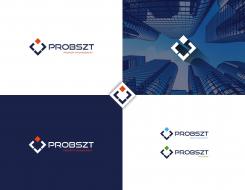
The logo represents the services(sub departments) which you offer from your management. The main orange square represents the different services you offer and the blue objects shows in all ways you can handle those solutions in a responsive way. The overall logo looks like a upscale ad clean concept for your firm.
Thank you -
Bewoulf says
Bottom blue objects = Management
Top square = services and sub departments -
c.probszt@remax-solutions.at says :
i like the colours and the design at all. i am just afraid that the contrast is not that advantageous. one of the ads should be directly on houses which are under our administration (administrated by...) in a format A5 or A4 landscape on plexiglass so would it have a clear recognition and readability?
-
This contest is finished. Its not possible to reply anymore.
-
-
-
Description by designer Bewoulf:
Concept 1
-
c.probszt@remax-solutions.at says :
Looks very good. Very similar to another designers work but with something special
-
factor says
Dear Bewoulf,
Is not ok stole the whole concept and idea for me, all your story for the logo is actually mine. your just rotate and cube put up. Your new designer here and that is not right to steal someone else's idea.
greeting,
Milla -
Bewoulf says
Hello factor, my design is completely original and i don't want to steal or copy from other designers ok. Don't under estimate some one's creativity. The explanations are based on the company profile with my final art work. You need to learn more basics, i am new here but i am not a new designer i have 6+ years of experience in this field.
FYI see this link to find out when this artwork is designed.
http://www.designcrowd.com/design/4230110
http://designers.designcrowd.com/designer.aspx?designerId=21188&freelance;-design-page=3
Rgds
kartik -
factor says
Dear B,
In this contest not mentioned anywhere cube design. i work on that and crate P letter with part of solution. with other departments with different color. you look my design and use all that for your design with my idea, and story that is fact. -
Bewoulf says
Hello, first of all think well square is the common element we can use any where in the contests. If client like square or circles or rectangles in previous designs we can use those elements in your own concepts but it shouldn't be same as others design. In this case both designs are different but we both used common square element ok. Got it?
And also from the start you are saying you used cube elements my concept is square. There is no P in my concept too. I explained from my design not from yours . -
Bewoulf says
My design is entirely different concept.
Three bottom elements represents like a management/company that holding the services they provide Like Asset management, property management etc. Its more than your concept. cube,P or something etc... -
This contest is finished. Its not possible to reply anymore.
-

