Modernization of our logo
Contest details:
Silver
- Contest holder: Getränke Quelle
- Category: Logo design
- Total budget: € 329.00
- Start date : 26-11-2020 11:31
- Ending date : 10-12-2020 00:00
- Status : Ended
- Relevant files:
-
Available languages:


- Number of designs: 171
-
Response rate:
low high
Needs:
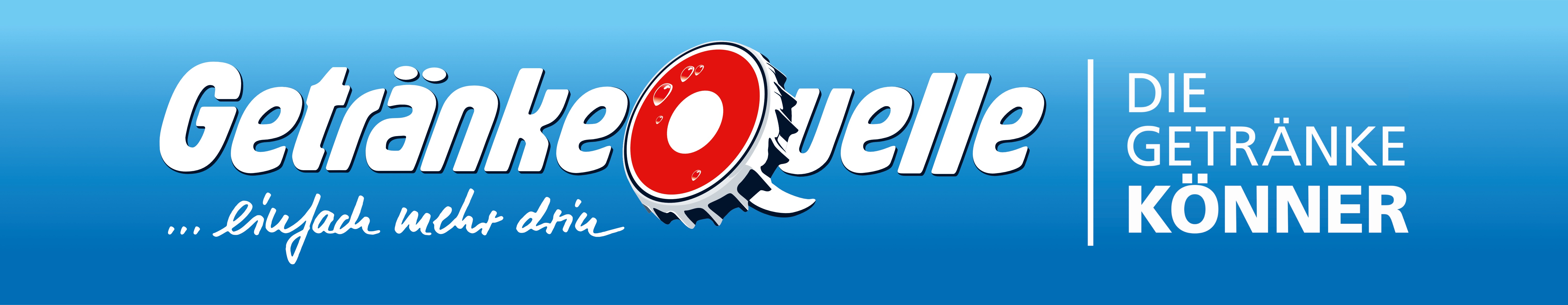
As we are part of the union „| DIE GETRÄNKEKÖNNER“ we need to include their branding into our logo. The logo (font included) must not be changed.
We use our logo for Facebook, Google and our websites, and also for outdoor advertising.
We are looking forward to see your design(s)!
Company description:
In our 25 beverage stores we sell regional, national as well as international beers, soft drinks, mineral water, wine and different spirits. We also offer rental-services.
Target group:
Colors, favourites and other requirements
- Our slogan „… einfach mehr drin“ must be a part of the logo
- Colour: the background should still be a blue colour (it doesn’t have to be a colour gradient)
- Symbol: the crown cap doesn’t have to be part of the logo anymore
+++ We'd love to see a so-called "negative logo" if you have an idea for such +++
Fabian1
-
-
No comments
-
This contest is finished. Its not possible to reply anymore.
-
-
-
No comments
-
This contest is finished. Its not possible to reply anymore.
-
-
-
Fabian1 says
silahkan cek ..
salam fabian. -
Getränke Quelle says :
We held a conference and we think it still doesn’t look really modern.
It looks like a logo from the 80ies or 90ies.
Please try something else.
Surprise us. -
This contest is finished. Its not possible to reply anymore.
-
-
-
Fabian1 says
check please..
greetings fabian.
-
This contest is finished. Its not possible to reply anymore.
-
-
-
Fabian1 says
Is this what you are asking for ... if you need a revision don't hesitate to let me know ...
greetings Fabian 1 .. -
Getränke Quelle says :
Hello Fabian, thank you very much. That looks good.
Because we use and want to use our logo on a blue background, we'd like to see a white bottle inside the Q (on the blue background).
I would be good to see the end of the bottle turning into the Q's "line".
Could you put the slogan "... einfach mehr drin" more to the right? So its' end is where the crown cap starts.
Kind regards -
Fabian1 says
of course you can, I'll do it right away ...
greetings fabian1 .. -
This contest is finished. Its not possible to reply anymore.
-
-
-
Fabian1 says
please check...
-
Getränke Quelle says :
We prefer the first one.
Please edit your first design again:
- take the font for "... einfach mehr drin" from your newest design
- maybe the bottle inside the crown cap could become the the line of the Q? -
Fabian1 says
i will revise what you ask ..
thanks. -
This contest is finished. Its not possible to reply anymore.
-
-
-
Getränke Quelle says :
We prefer the one from before...
Maybe a bottle (without the blue line inside) in a less detailed crown cap? -
This contest is finished. Its not possible to reply anymore.
-
-
-
Getränke Quelle says :
I think the bottle inside crown cap is a bit too much. I'd use either the bottle or the crown cup.
Please try a more modern and elegant font for "Getränke Quelle".
Please add the points to "... einfach mehr drin". -
This contest is finished. Its not possible to reply anymore.
-