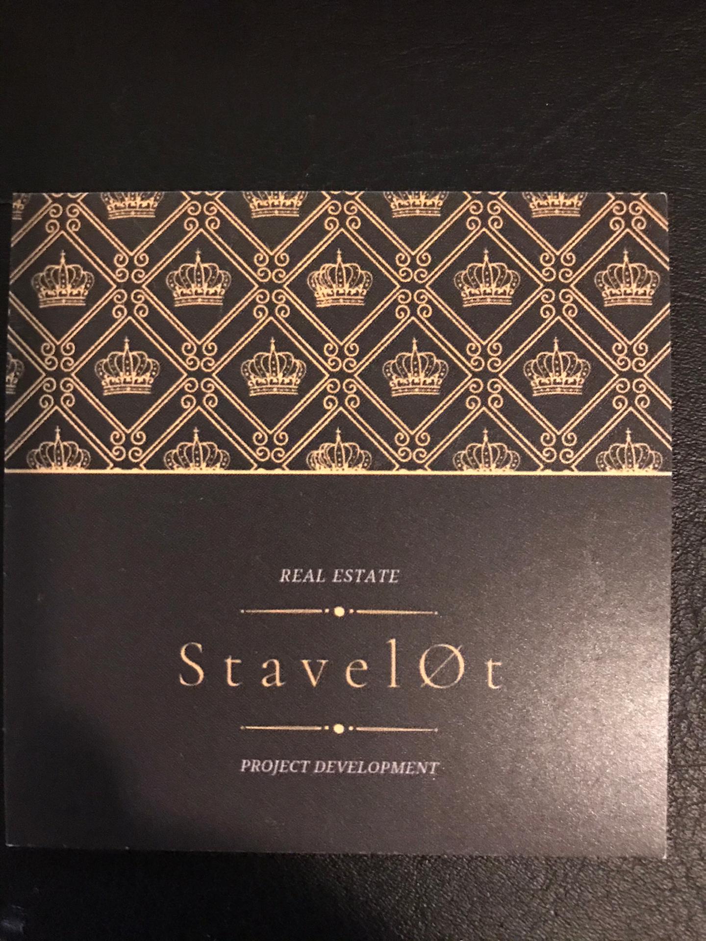
Logo for real estate developer
Contest details:
Bronze


Needs:
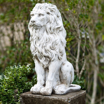
Suggestion: Decorate the end of the lion's tail and the crown in the same color.
The crown: not pointy. 2 examples have been added in the appendix. Minimalist and 'blocky' on the one hand, and curved lines on the other. Preferably, the crown can be floating.
Right next to the logo, space is provided for the name 'Groep Van Meirvenne'. The name is quite long and can be divided over several lines.
The appendix also contains an example of a 'shield', in which the logo can be placed. However, this is up to you.
Try to give it a modern look.
Delivery in: AI, jpeg, eps, png (transparent background)
color codes: hex, rgb, cymk
Company description:
Logo for a real estate developer.
Brandname: Groep Van Meirvenne
Target group:
Appearance: luxury and exclusivity
Colors, favourites and other requirements
Main colors: Gold, black or white
Sub colors: emerald green or burgundy red
Not necessary to use all colors.
krisi
-
-
No comments
-
This contest is finished. Its not possible to reply anymore.
-
-
-
No comments
-
This contest is finished. Its not possible to reply anymore.
-
-
-
nick_vm says :
Dag Krisi,
Dankjewel voor je design.
Ik geef je graag mee wat ik fijn vind en wat mij minder aanspreekt.
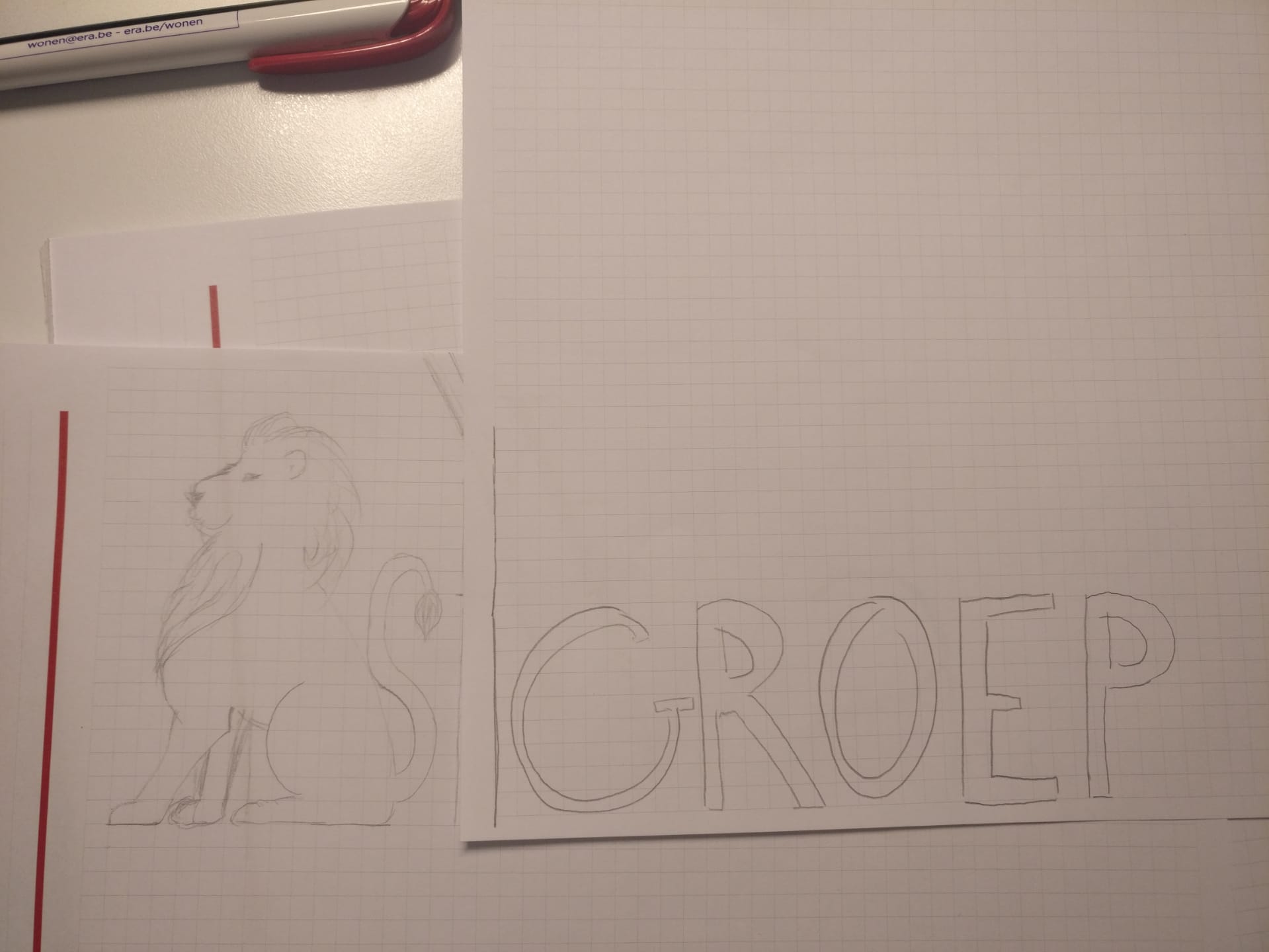
> De leeuw is goed
> jouw insteek met de lijn aan de onderkant is leuk gezien
> De stijl van de kroon lijkt ons minder passen bij de leeuw omdat die zo anders is
> de gradient hadden we liever niet in cirkel vorm maar verticaal, voor het goud best baseren op de afbeelding in bijlage.
> We willen de focus eerder leggen op Van Meirvenne dan op Groep maar wel mooi dat de woorden meegaan met de leeuw
> lettertype is vrij basic
Vriendelijke groeten,
Nick -
This contest is finished. Its not possible to reply anymore.
-