Fresh and modern logo for Neighbourhood Association
Contest details:
- Contest holder: Buurtvereniging Oude Gracht West
- Category: Logo design
- Total budget: € 250.00
- Start date : 29-10-2020 09:52
- Ending date : 22-11-2020 00:00
- Status : Ended
- Required formats: jpg,psd,ai
- Relevant files:
-
Available languages:


- Number of designs: 67
-
Response rate:
low high
Needs:
We have started a new neighborhood / residents association for our neighborhood "Oude Gracht West" in Eindhoven.
The neighborhood has about 3000 inhabitants and is fairly quiet. We would like to connect and have fun with each other. It would be nice if the themes "Together" and "Fun" would radiate from the logo. Our neighborhood is characterized by a lot of nature and greenery. The river "Oude Gracht" flows through our neighborhood, and so many trees, plants and aquatic animals can be found there.
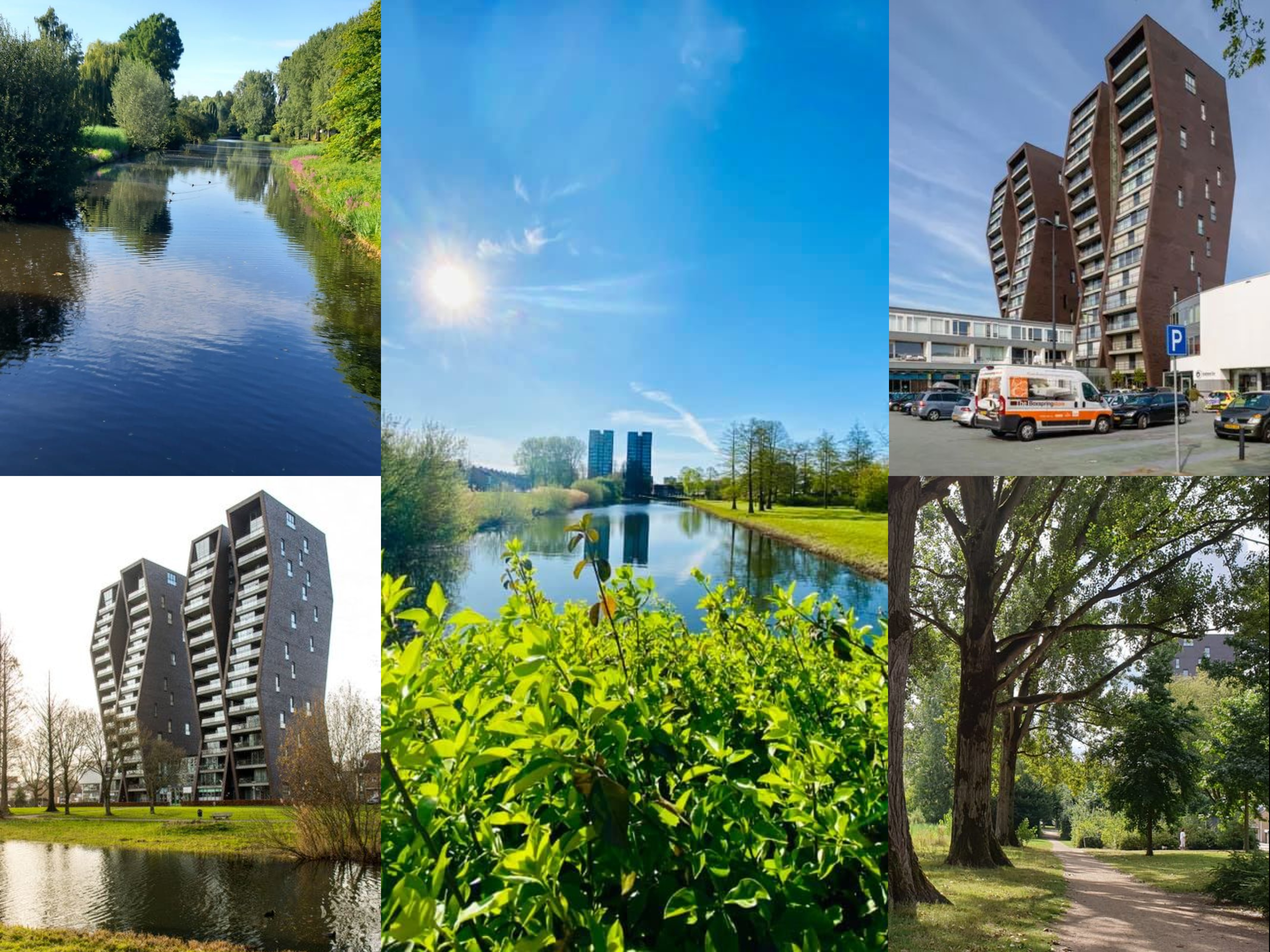
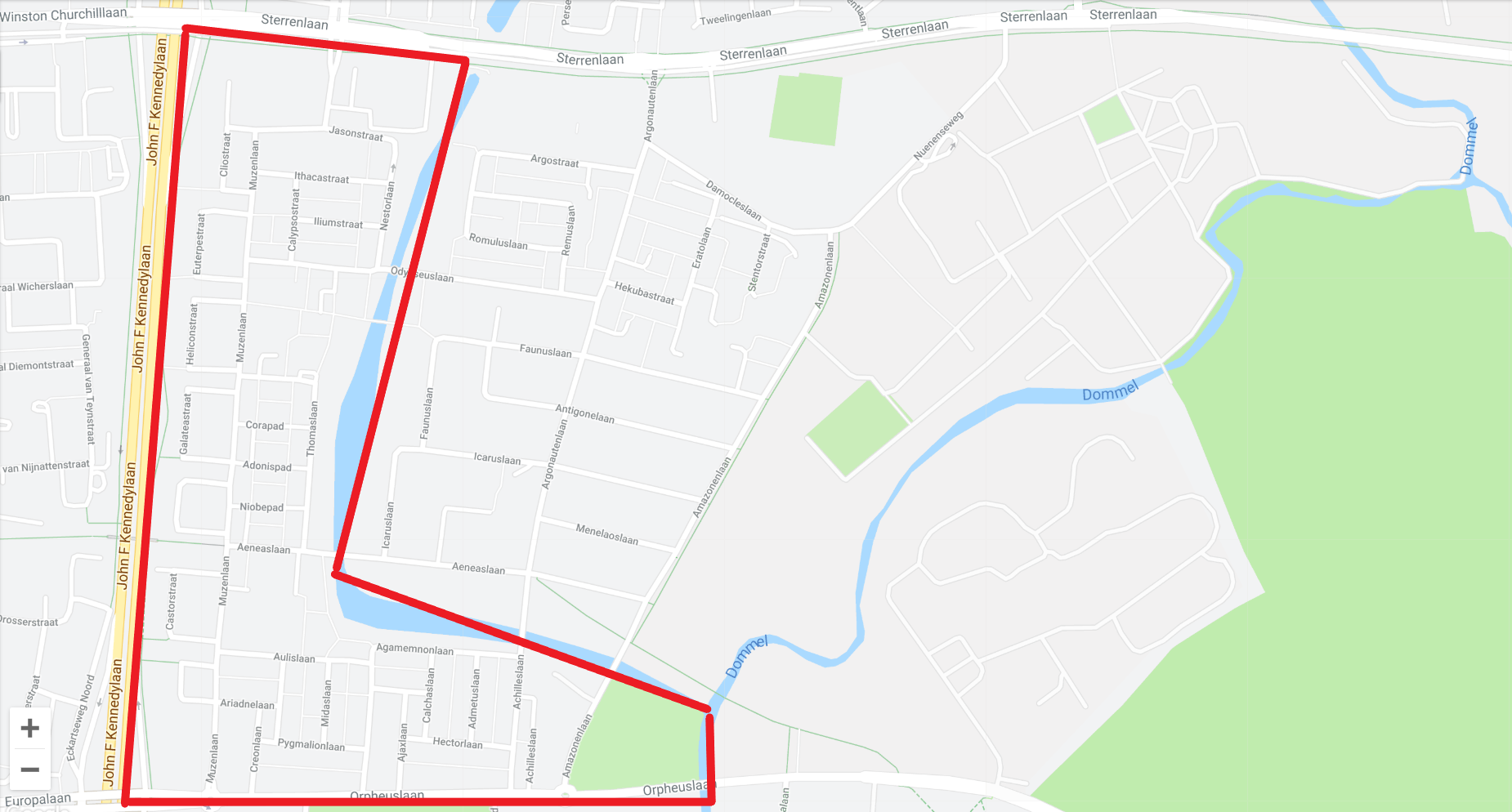
The neighborhood itself on the map is an L-shape. We have added a collage and a map to give you inspiration.
The eye-catcher of the neighborhood is the apartment building "De Ranken", a high flat that with its special oblique angles can be seen from every angle in the neighborhood.
This may, but does not have to, be incorporated into the logo. But doesn't have to be the central focus.
We would like to receive a logo which will also be used on our website and future printed materials. More information about our association can be found at www.oudegracht-west.nl
keywords:
- to connect
- neighbourhood
- together
- green
- nature
- fun
Company description:
Our association has just started. The association is open to all residents of the neighborhood. The aim of the association is to connect the residents through fun activities. And bringing together supply and demand for requests for help.
Target group:
residents of the neighborhood, municipality, other neighborhood organizations and associations
Colors, favourites and other requirements
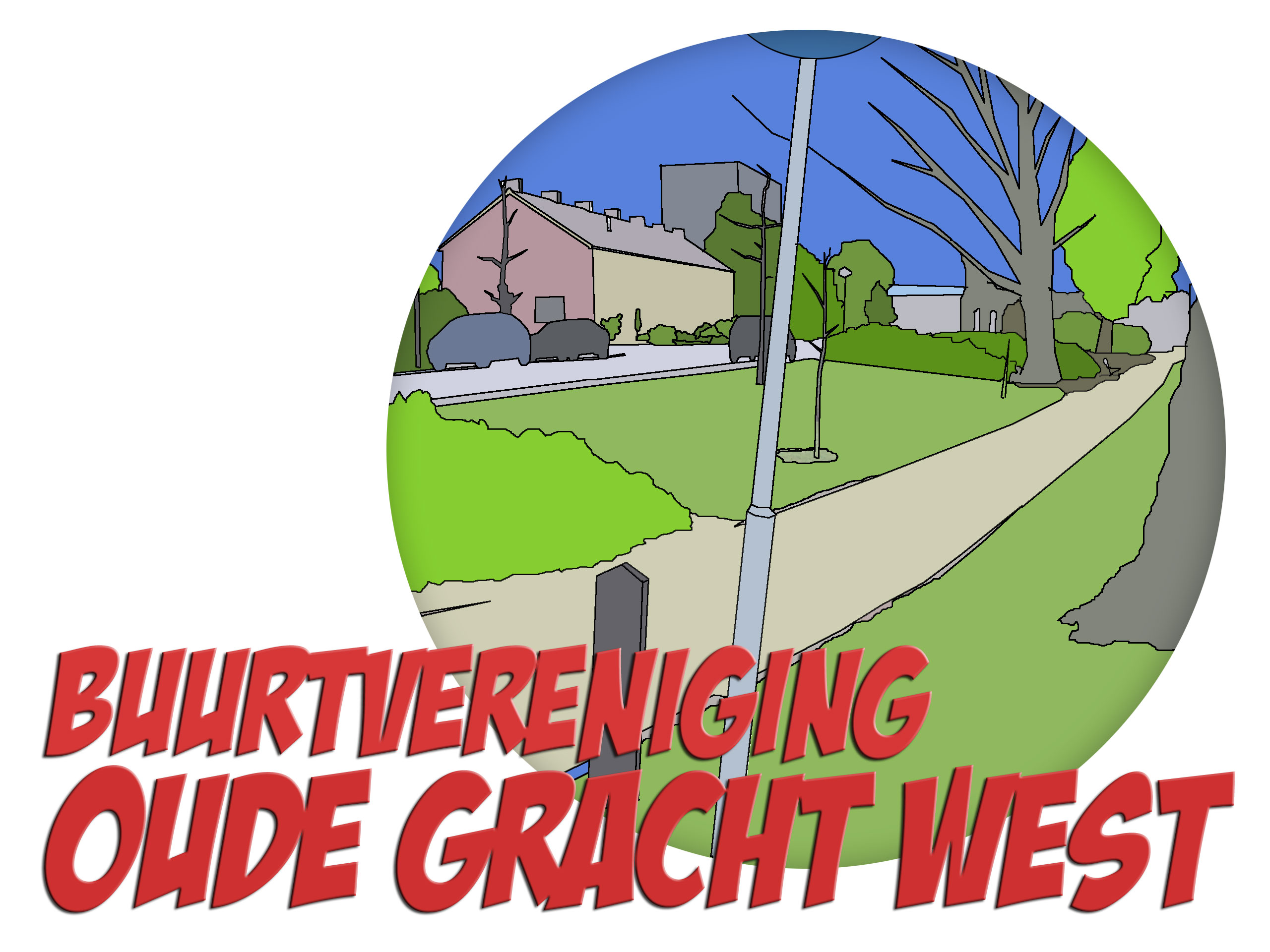
The appendices also contain the old logo of the previous association. This is too cartoonic but it touches the core of the neighborhood with nature and the Ranken in the background.
The round shape does appeal to us.
We are looking for a sleeker and more modern logo, without becoming TOO corporate.
The font used must either be free or be available for purchase at a low one-time price.
The word mark and logo must be able to be used together, but also separately.
SimpleLife
-
-
Description by designer SimpleLife:
Hi !
Thank you for your feedback earlier
What do you think about this one ? I made the building at the center of the logo
Warm Regards,
SimpleLife -
Buurtvereniging Oude Gracht West says :
Hi, thank you for your alteration. I don't know which is better. I think they're both good.
-
This contest is finished. Its not possible to reply anymore.
-
-
-
No comments
-
This contest is finished. Its not possible to reply anymore.
-
-
-
Buurtvereniging Oude Gracht West says :
Very nice. I like it that the building is offcenter. Still their, but not quite the center of attention. I do like the version with the letters outside of the cirkel better. In that version, the birds almost make a smiley face if you look at it from a distance.
-
This contest is finished. Its not possible to reply anymore.
-