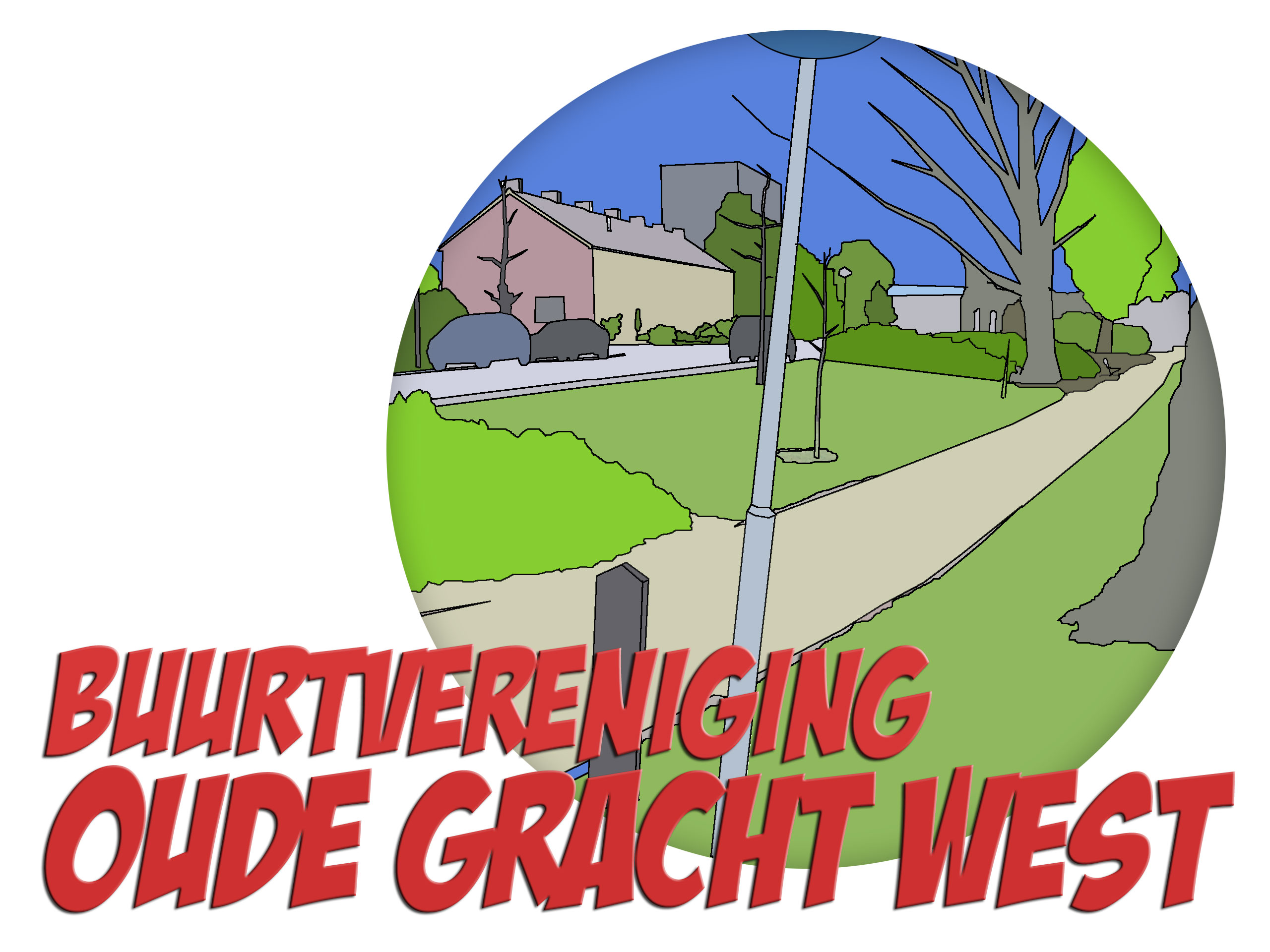
Fresh and modern logo for Neighbourhood Association
Contest details:
- Contest holder: Buurtvereniging Oude Gracht West
- Category: Logo design
- Total budget: € 250.00
- Start date : 29-10-2020 09:52
- Ending date : 22-11-2020 00:00
- Status : Ended
- Required formats: jpg,psd,ai
- Relevant files:
-
Available languages:


- Number of designs: 67
-
Response rate:
low high
Needs:
We have started a new neighborhood / residents association for our neighborhood "Oude Gracht West" in Eindhoven.
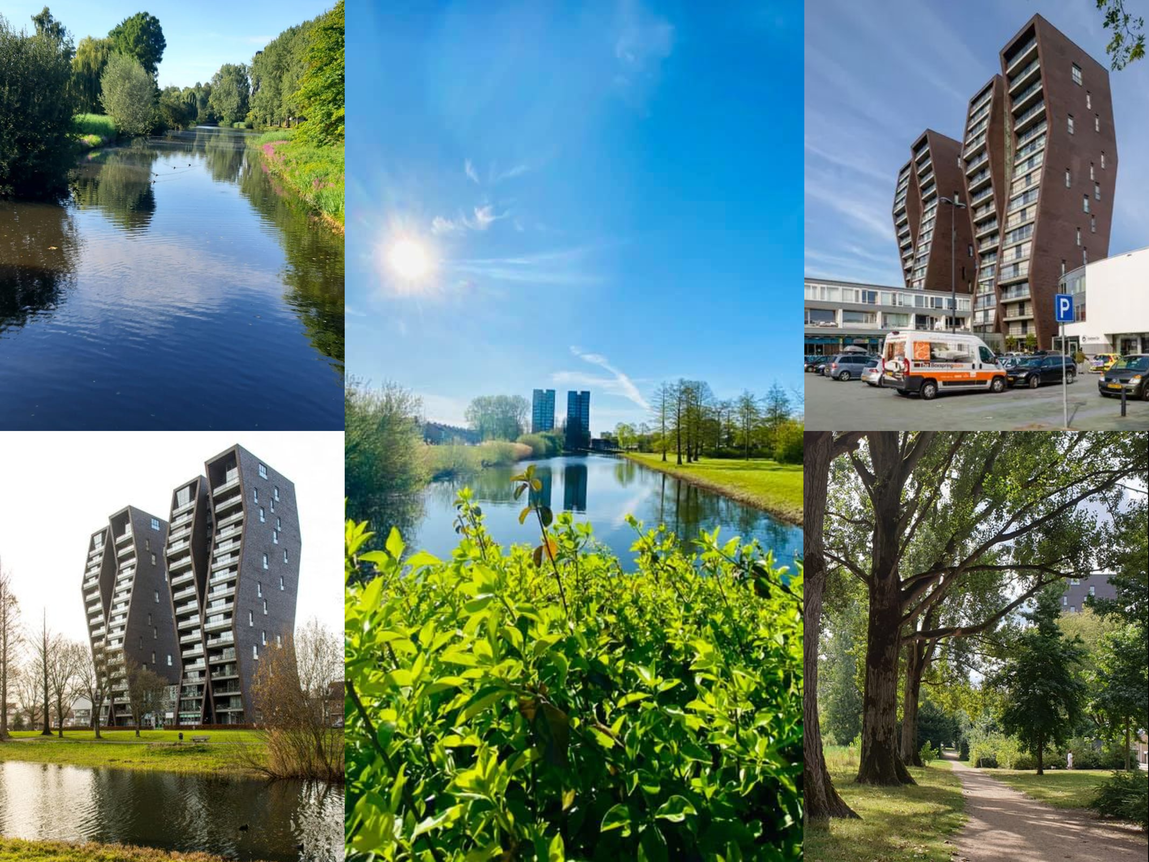
The neighborhood has about 3000 inhabitants and is fairly quiet. We would like to connect and have fun with each other. It would be nice if the themes "Together" and "Fun" would radiate from the logo. Our neighborhood is characterized by a lot of nature and greenery. The river "Oude Gracht" flows through our neighborhood, and so many trees, plants and aquatic animals can be found there.
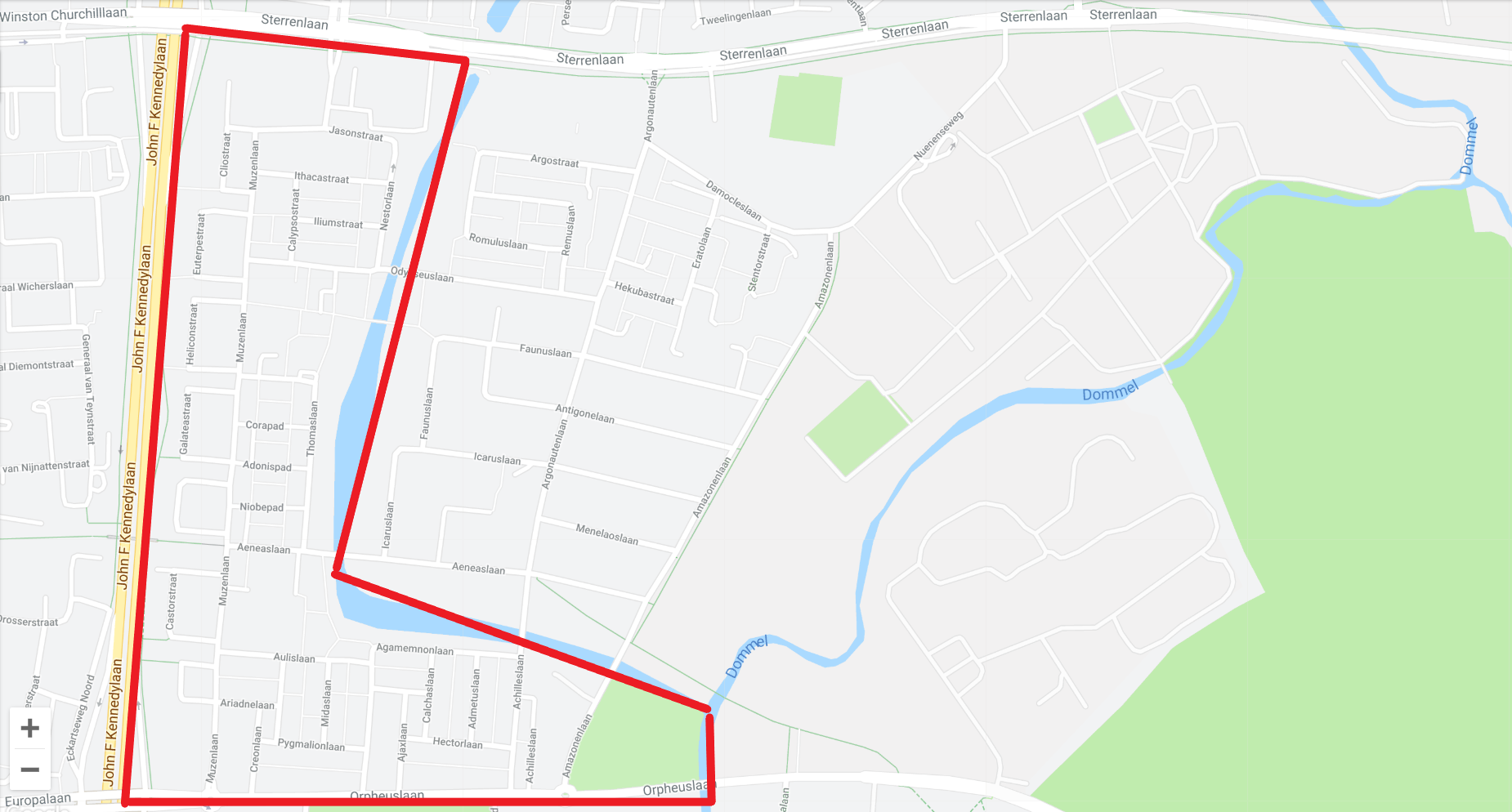
The neighborhood itself on the map is an L-shape. We have added a collage and a map to give you inspiration.
The eye-catcher of the neighborhood is the apartment building "De Ranken", a high flat that with its special oblique angles can be seen from every angle in the neighborhood.
This may, but does not have to, be incorporated into the logo. But doesn't have to be the central focus.
We would like to receive a logo which will also be used on our website and future printed materials. More information about our association can be found at www.oudegracht-west.nl
keywords:
- to connect
- neighbourhood
- together
- green
- nature
- fun
Company description:
Our association has just started. The association is open to all residents of the neighborhood. The aim of the association is to connect the residents through fun activities. And bringing together supply and demand for requests for help.
Target group:
residents of the neighborhood, municipality, other neighborhood organizations and associations
Colors, favourites and other requirements
The appendices also contain the old logo of the previous association. This is too cartoonic but it touches the core of the neighborhood with nature and the Ranken in the background.
The round shape does appeal to us.
We are looking for a sleeker and more modern logo, without becoming TOO corporate.
The font used must either be free or be available for purchase at a low one-time price.
The word mark and logo must be able to be used together, but also separately.
sencefordesigning
-
-
sencefordesigning says
Buurtvereniging op dit moment uitgelijnd aan de rechterkant, omdat dit mooi in evenwicht staat met Oude gracht Noord. Kunnen we natuurlijk ook onder of boven uitlijnen, wat is jullie voorkeur?
-
Buurtvereniging Oude Gracht West says :
Hai, dit is het nog niet helemaal. Kun je "buurtvereniging" proberen uit de "G" te laten starten, en dan tot de toren. Een andere optie om hem uit de W te starten en dan naar onder. En anders gewoon midden onder.
-
Buurtvereniging Oude Gracht West says :
Hai, dit is het nog niet helemaal. Kun je "buurtvereniging" proberen uit de "G" te laten starten, en dan tot de toren. Een andere optie om hem uit de W te starten en dan naar onder. En anders gewoon midden onder.
-
This contest is finished. Its not possible to reply anymore.
-
-
-
Description by designer sencefordesigning:
Bedankt voor de snelle feedback. Hierbij wat aanpassingen. Het gebouw, zouden jullie die het liefst in de cirkel willen hebben of mag hij er iets buiten vallen? Heb dit gedaan om het toch wat speelser te laten ogen, ik las dat jullie het logo liever niet té zakelijk hebben. Op deze schetsen komt de natuur er meer uit, wilde niet te veel poespas toevoegen omdat het dan misschien wel erg druk zal zijn. Hoe denken jullie hier over?
Mvg en tot het volgende berichtje,
Femke -
Buurtvereniging Oude Gracht West says :
Ja, buiten de cirkel vind ik ook mooi. Vind de toevoeging van water leuk als riviertje. Misschien nog iets grotere tekst, en eventueel met toevoeging van "buurtvereniging" ?
-
This contest is finished. Its not possible to reply anymore.
-
-
-
Description by designer sencefordesigning:
Het is natuurlijk pas een schets, even pijlen wat jullie wel en niet mooi vinden. De verdere aanpassingen kunnen we samen naar kijken.
-
Buurtvereniging Oude Gracht West says :
zie ander gecombineerd commentaar.
-
This contest is finished. Its not possible to reply anymore.
-
-
-
Description by designer sencefordesigning:
Dag!
Eventuele feedback/aanpassingen is altijd mogelijk! Ik hoor graag van jullie.
Mvg,
Femke van Sence for Designing -
Buurtvereniging Oude Gracht West says :
Hai Femke ! Goeie voorzet. Ipv "de oude gracht west", alleen "oude gracht west". Het water van het logo links onder spreekt me het meest aan, maar met een zwarte "flat". De flat is zeker gaaf, mag wat kleiner aan de onderkant (dus soort van opschuiven naar boven, zonder dat de bovenkant hoger word). dan het je misschien wat meer ruimte onderin voor wat extra natuur. De andere versies valt het flatgebouw mooie in de cirkel. Ik hou ervan dat het maar 3 kleuren is (zwart/wit, groen, zwart), dat is prettig voor drukwerk, of borduurwerk oid.
-
This contest is finished. Its not possible to reply anymore.
-