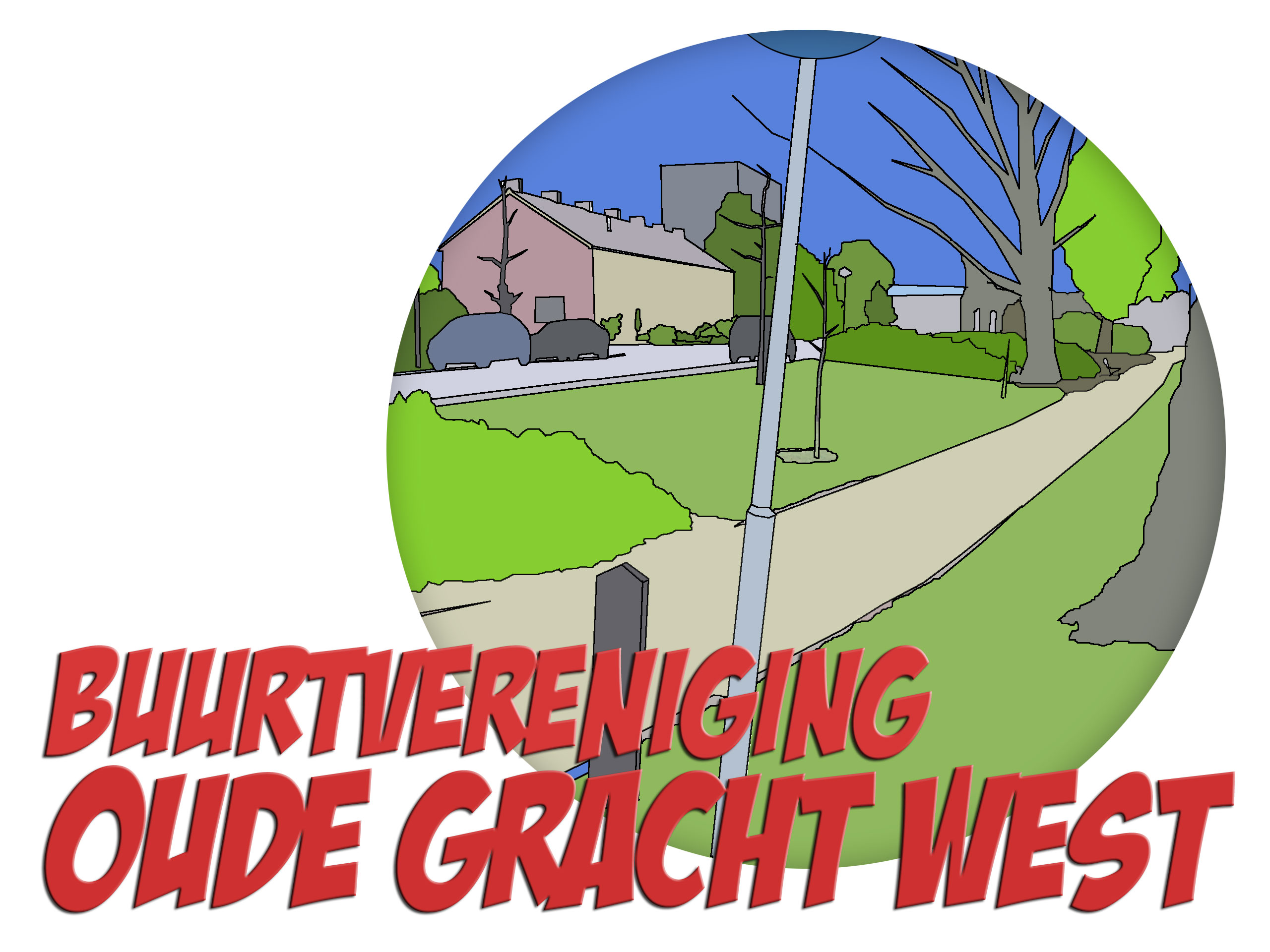
Fresh and modern logo for Neighbourhood Association
Contest details:
- Contest holder: Buurtvereniging Oude Gracht West
- Category: Logo design
- Total budget: € 250.00
- Start date : 29-10-2020 09:52
- Ending date : 22-11-2020 00:00
- Status : Ended
- Required formats: jpg,psd,ai
- Relevant files:
-
Available languages:


- Number of designs: 67
-
Response rate:
low high
Needs:
We have started a new neighborhood / residents association for our neighborhood "Oude Gracht West" in Eindhoven.
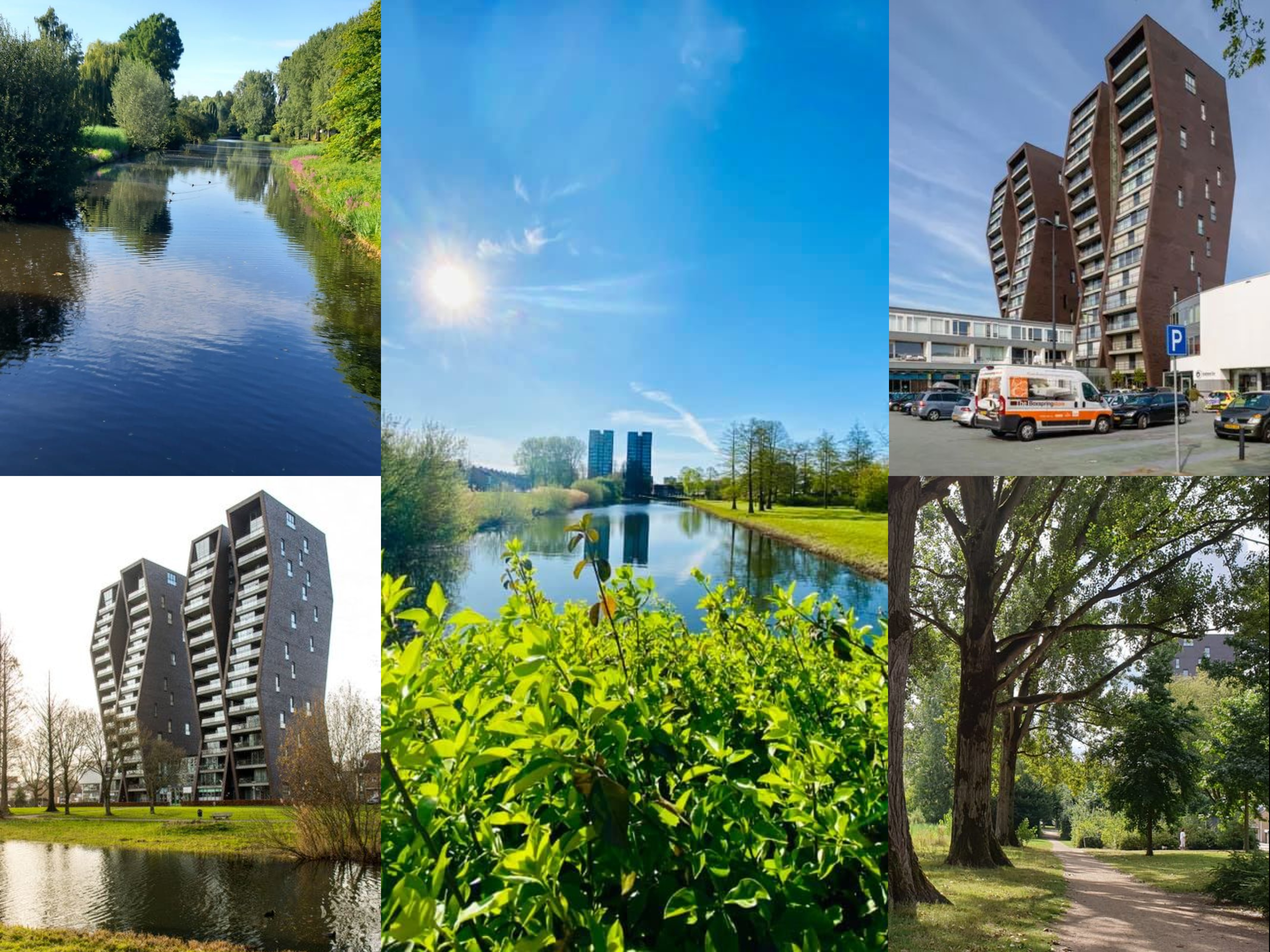
The neighborhood has about 3000 inhabitants and is fairly quiet. We would like to connect and have fun with each other. It would be nice if the themes "Together" and "Fun" would radiate from the logo. Our neighborhood is characterized by a lot of nature and greenery. The river "Oude Gracht" flows through our neighborhood, and so many trees, plants and aquatic animals can be found there.
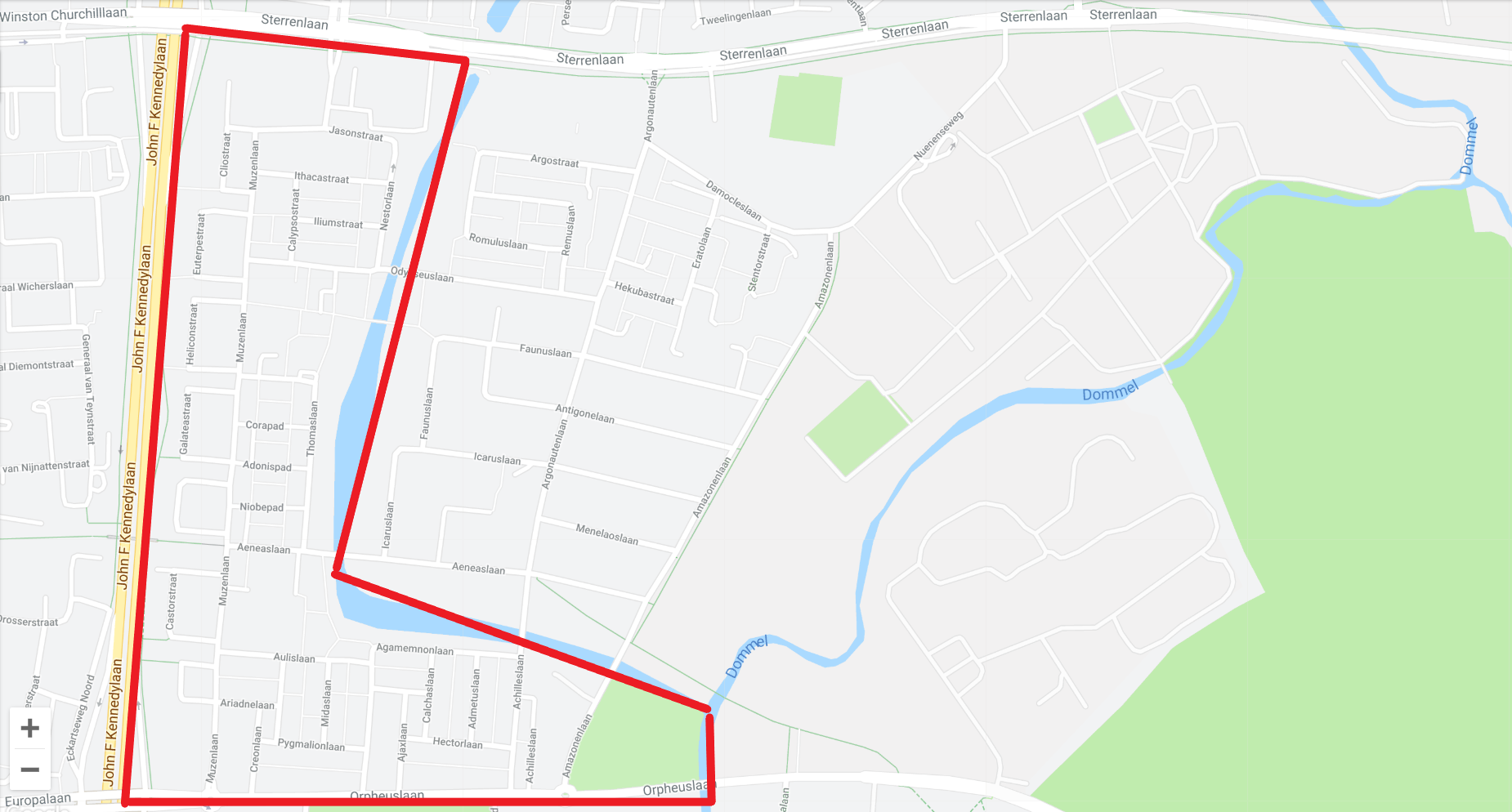
The neighborhood itself on the map is an L-shape. We have added a collage and a map to give you inspiration.
The eye-catcher of the neighborhood is the apartment building "De Ranken", a high flat that with its special oblique angles can be seen from every angle in the neighborhood.
This may, but does not have to, be incorporated into the logo. But doesn't have to be the central focus.
We would like to receive a logo which will also be used on our website and future printed materials. More information about our association can be found at www.oudegracht-west.nl
keywords:
- to connect
- neighbourhood
- together
- green
- nature
- fun
Company description:
Our association has just started. The association is open to all residents of the neighborhood. The aim of the association is to connect the residents through fun activities. And bringing together supply and demand for requests for help.
Target group:
residents of the neighborhood, municipality, other neighborhood organizations and associations
Colors, favourites and other requirements
The appendices also contain the old logo of the previous association. This is too cartoonic but it touches the core of the neighborhood with nature and the Ranken in the background.
The round shape does appeal to us.
We are looking for a sleeker and more modern logo, without becoming TOO corporate.
The font used must either be free or be available for purchase at a low one-time price.
The word mark and logo must be able to be used together, but also separately.
MellGraphics
-
-
Buurtvereniging Oude Gracht West says :
Top
-
Margriet Pronk says
Prachtig Melvin, schitterend gedaan!
-
MellGraphics says
Dankjewel Margriet
-
This contest is finished. Its not possible to reply anymore.
-
-
-
Buurtvereniging Oude Gracht West says :
Top
-
MellGraphics says
Ik denk dat u wellicht het ontwerp van Krisi heeft gevonden :)
-
Buurtvereniging Oude Gracht West says :
Is ook een leuk design. Maar nog niks beslist hoor ! Er gaan straks meerdere mensen naar de inzendingen kijken.
-
This contest is finished. Its not possible to reply anymore.
-
-
-
Description by designer MellGraphics:
Bij deze voor u aangepast. Ik heb gekozen voor zwart, wit en groen, maar het zwart kan ook vervangen worden voor antraciet :)
-
Buurtvereniging Oude Gracht West says :
Ja, veel beter ! Ik kan niet kiezen, en zelfs niet aangeven wat ik nog zou veranderd willen zien. Ik vind je voorbeelden op verschillend drukwerk ook echt een pré.
-
This contest is finished. Its not possible to reply anymore.
-
-
-
Buurtvereniging Oude Gracht West says :
Super mooi, en ik hou ervan dat je het logo al op verschillende onderwerpen hebt getoond. Het voldoet aan alle specs, maaaarrrrr.... en dit kan ik moeilijk uitleggen. Mijn eerste blik deed me het logo denken aan iets wat van een agrarisch bedrijf zou zijn, ik dekn dat dat komt door de gebruikte groentinten. Daarnaast lijken de ranken van een afstand wat fallisch, ook met die 2 bomen aan de zijkant.
-
MellGraphics says
Ik zal het voor u aanpassen de kleuren :)
-
MellGraphics says
Wat bedoelt u met Fallisch? Ken het woord niet :)
-
MellGraphics says
Bedoelt u dat de bomen te dicht op staan bij de gebouw?
-
Buurtvereniging Oude Gracht West says :
Ok, om het wat platter te zeggen. Van een afstand lijkt het gebouw op een penis, en de 2 bomen de ballen. Dus als je verder uitgezoomd bent.
-
MellGraphics says
Ikz al het aanpassen
-
This contest is finished. Its not possible to reply anymore.
-