Evolution and maturity of a logo Shenandoah
Contest details:
Silver
- Contest holder: Shenandoah
- Category: Logo design
- Total budget: € 369.00
- Start date : 14-09-2019 15:40
- Ending date : 07-10-2019 10:10
- Status : Ended
- Relevant files: None
-
Available languages:


- Number of designs: 247
-
Response rate:
low high
Needs:
we are looking to evolve an existing logo since 1992.
Shenandoah
Shenandoah is a show production company, an artistic agency, a creator of emotion, an interface between the world of performing arts of all kinds (musicians, dancers, street performers, visual performers, circus artists, ..) and the world organizers.
Website: www.shenandoah.eu
Present on the market since 1992 and in decline.
We seek to give a second wind by reworking the image and to evolve the logo.
Important elements.
We like the current logo, the idea is not to change it completely but just to give it maturity, weight, experience, body, sitting.
We like the calligraphic side, handmade, as a signature but we find today too childish.
The new positioning is decidedly very upscale, premium, luxury.
But luxury as an antique dealer with exclusive pieces, with soul and lived. No bling bling.
Ideas .. but not exhaustive, we prefer to let your creativity speak.
- Put gold in it (but old gold pre-Columbian kind that smooth gold)
- maybe embed it in a noble material
-....
To you and thank you in advance.
Shenandoah Team
Company description:
Shenandoah is a show production company, an artistic agency, a creator of emotion, an interface between the world of performing arts of all kinds (musicians, dancers, street performers, visual performers, circus artists, ..) and the world of organizers
Target group:
Private, coroporate - premium
Colors, favourites and other requirements
Naelix
-
-
No comments
-
This contest is finished. Its not possible to reply anymore.
-
-
-
Naelix says
Bonjour,
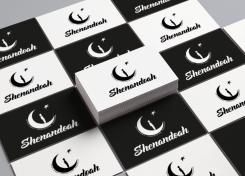
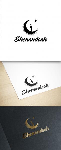
Voici mon design revisité.
Une typo apportant de la modernité au logo en gardant l'esprit manuscrit, la lune est simplifiée et épurée pour renforcer cet esprit.
J'ai gardé la silhouette du personnage que je trouve intéressante et l'aspect de l'étoile fait main également, car elle donne de l’authenticité à la composition.
L'avantage d'un visuel (lune, personnage, étoile) indépendant est que pouvez également vous en servir seul, sans le nom et le slogan pour créer un tampon ou autre. De plus il se distingue facilement et est aisément reconnaissable.
N'hésitez pas à me faire vos retours et vos suggestions.
Cordialement,
Antoine -
This contest is finished. Its not possible to reply anymore.
-


