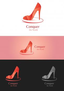
Design a logo for a website for ambitious career women
Contest details:
Bronze
- Contest holder: zoeschouten@hotmail.com
- Category: Logo design
- Total budget: € 229.00
- Start date : 13-09-2015 23:45
- Ending date : 27-09-2015 22:30
- Status : Ended
- Required formats: jpg,ai,pdf,eps
- Relevant files: None
-
Available languages:


- Number of designs: 56
-
Response rate:
low high
Needs:
The logo will be shown on the website 'conquertheworld.nl', business cards and promotion material. In the future also on products. The logo need to show the words 'Conquer the World'.
Company description:
Conquertheworld.nl is created from the need to provide women with all the needs to maximize their career and development.
Some keywords for the style of conquertheworld.nl:
- Powerfull;
- Business;
- Feminine;
- Ambitious;
- Knowledgeable;
- Fashionable.
Target group:
conquertheworld.nl aims at women which have their career en development on a high priority. The women are between 20 and 40 years old.
Colors, favourites and other requirements
- Not to girly;
- The logo should shown the words 'Conquer the World'.
Strajo
-
-
Description by designer Strajo:
Hi,
Here are examples of logo with text that you wanted. I have put the requested text underneath "Conquer the World", but as you can see it is not much visible ( and the logo is "heavy" with text underneath it). That is why I have put two more examples with text next to the logo, and without the logo (just the main text and the requested). I hope that you will like it and feedback. -
This contest is finished. Its not possible to reply anymore.
-
-
-
Description by designer Strajo:
Hi,
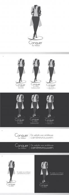
Here is logo in black and white. As I said it is neither completly white nor black (they are some shades of grey).I have also addes some stationery for the logo. I hope that you will like it and feedback. -
zoeschouten@hotmail.com says :
Hi, thank you! I like both the sillouets with black and white letters. Can you maybe add the following sentence below the 'Conquer the world.nl'text:
'De website voor ambitieuze carrièrevrouwen'
It is in Dutch and says 'the website for ambitious careerwomen'.
If I choose this sillouet as logo, would it be possible that I receive the sillouet and text together, but also the text and sillout separetly? -
Strajo says
Hi,
Thank you for your feedback. I will add the sentence in the logo, and of course you will receive the silhouette and text in both choices. -
This contest is finished. Its not possible to reply anymore.
-
-
-
Description by designer Strajo:
Hi,
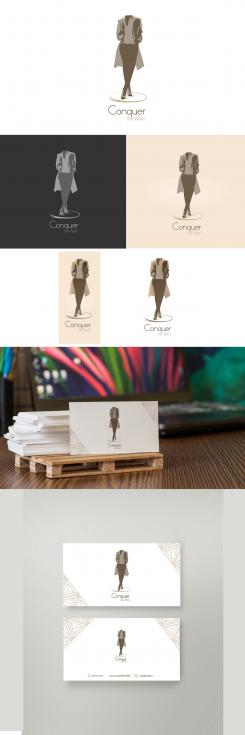
I have seen your feedback and I am very glad that you liked my design. I have sharpened the sillouet as more as I could do. I hope that you will like it and feedback. -
zoeschouten@hotmail.com says :
Hi, looks really good. Can you add the '.nl' in the text? That it will be 'Conquer the world.nl'.
And, I don't know if it possible: make a black&white; sillouet, with the text and main colour in black? -
Strajo says
Hi,
Thank you for your feedback. I just wanted to say that I can make black and white sillouet but in shades of gray, because if you put precisely black and white it won't look good on white surface (and also the text would be more highlighted than the logo). I will do it in shades of gray for you to see how it would look like. -
This contest is finished. Its not possible to reply anymore.
-
-
-
Description by designer Strajo:
Hi,
I have seen your comment about adding sillouet and I have done somethnig. I have made a sillouet of your picture nad removed some details. I hope that you will like it and feedback -
zoeschouten@hotmail.com says :
Hi,
Again, I love your design and the font. Is it possible to make the sillouet with sharper lines, especially the legs? They look a bit too wide at hip-highed. -
This contest is finished. Its not possible to reply anymore.
-
-
-
Description by designer Strajo:
Hi,
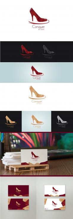
Thank you for your feedback. I have done little changes on logo as you wanted. As you can see i have added two variants of logo, and I have downsized the heel. The first one is in gradients of bordeaux colour, and the second one is in gradients of ocre colour. Also, I have added business card with two options (the brighter and darker). I hope that you will like it and feedback. -
This contest is finished. Its not possible to reply anymore.
-
-
-
Description by designer Strajo:
Hi,
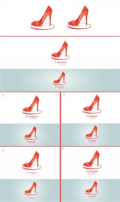
Thank you for your feedback, i amd very glad that you like my design. I did a research about font and here are some examples. I think that font of the logo should be something between clean and classical fonts, because of femine logo. Also i have added some details on logo. I hope that you will like it and feedback. -
zoeschouten@hotmail.com says :
Hi, thanks for the new font examples. I am attracted to number 3, with the tall lines on the q, l and w.
I showed the logo to women in my target group and their respons was the following:
- the heel is too high (to much prostitute, to less career woman)
- The colour of the heel is going along with the prostitute idea, maybe another colour? Like bordeaux.
- The heel must walk towards the other direction, going forward in stead of back. -
This contest is finished. Its not possible to reply anymore.
-
-
-
Description by designer Strajo:
Hi,
Here is my idea of logo. I hope that you will like it and feedback. -
zoeschouten@hotmail.com says :
Love it!! I love the color and the shapes. Can you maybe show me different fonts? I would like to compare more classique or more 'clean' fonts. Does that make any sense?
-
This contest is finished. Its not possible to reply anymore.
-

