Design a cool logo for Flip the script
Contest details:
- Contest holder: estherteunissen
- Category: Logo design
- Total budget: € 250.00
- Start date : 17-02-2021 21:42
- Ending date : 20-02-2021 00:00
- Status : Ended
- Required formats: jpg,psd,ai
- Relevant files: None
-
Available languages:


- Number of designs: 160
-
Response rate:
low high
Needs:
Flip the script replaces the current power structure in organizations for something better, releasing entrepreneurship, creativity and meaning in everyone who works in a team.
In the logo, we want that feeling to come back.
Company description:
Target group:
Colors, favourites and other requirements
joe hart
-
-
estherteunissen says :
We are struggling a lot, because there is no logo yet that is it. So we want to abandon the idea of the domino bricks. We think it's too much thought in our heads, but when we look at the stones in the logo's, it does not makes us happy.
That's why we'd like to open it up completely and see what comes.
If we're honest, at this point we have no idea what our logo should look like. We hope this doesn't block your creative inspiration... -
This contest is finished. Its not possible to reply anymore.
-
-
-
No comments
-
This contest is finished. Its not possible to reply anymore.
-
-
-
estherteunissen says :
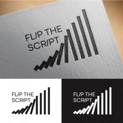
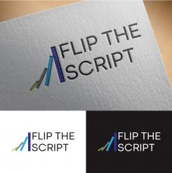
Thank you very much! It seems impossible in the logo right now that the last stone will topple over. The idea is that even that last big stone can fall over. We would like to have movement and tension in all the stones. And each stone is 1.5 times larger than the stone before it. And we would like to see more color and vibrancy.Less square and more organic.
-
estherteunissen says :
What I like about the logo is that you can see that the stones really move and get very big, even while starting with a small stone. De smalles stone in the logo even may be smaller This symbolizes that even with a very small first step you can initiate big changes.
-
joe hart says
Thanks if there is any revision feel free to give me feedback for this good job.
greetings joe hart. -
This contest is finished. Its not possible to reply anymore.
-
-
-
No comments
-
This contest is finished. Its not possible to reply anymore.
-
-
-
No comments
-
This contest is finished. Its not possible to reply anymore.
-
-
-
No comments
-
This contest is finished. Its not possible to reply anymore.
-

