Design a cool logo for Flip the script
Contest details:
- Contest holder: estherteunissen
- Category: Logo design
- Total budget: € 250.00
- Start date : 17-02-2021 21:42
- Ending date : 20-02-2021 00:00
- Status : Ended
- Required formats: jpg,psd,ai
- Relevant files: None
-
Available languages:


- Number of designs: 160
-
Response rate:
low high
Needs:
Flip the script replaces the current power structure in organizations for something better, releasing entrepreneurship, creativity and meaning in everyone who works in a team.
In the logo, we want that feeling to come back.
Company description:
Target group:
Colors, favourites and other requirements
paboy
-
-
No comments
-
This contest is finished. Its not possible to reply anymore.
-
-
-
No comments
-
This contest is finished. Its not possible to reply anymore.
-
-
-
No comments
-
This contest is finished. Its not possible to reply anymore.
-
-
-
estherteunissen says :
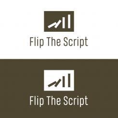
We are struggling a lot, because there is no logo yet that is 'it'. So we want to abandon the idea of the domino bricks. We think it's too much thought in our heads, but when we look at the logos we don't like the idea of those stones in a logo at all.
That's why we'd like to open it up completely and give your creativity free rein.
If we're honest, at this point we have no idea what our logo should look like. We hope this doesn't block your creative inspiration... -
This contest is finished. Its not possible to reply anymore.
-
-
-
No comments
-
This contest is finished. Its not possible to reply anymore.
-
-
-
Description by designer paboy:
hi
lease check this, thanks -
This contest is finished. Its not possible to reply anymore.
-
-
-
estherteunissen says :
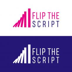
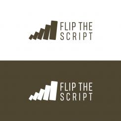
I like it that there are more stones than just 4. But the first stone has to be very small and the biggest stone very big and each stone is 1,5 time bigger than the last (see attachment in the briefing to see what I mean). The position of the stone left to the word 'flip the script' I like the most of your variatons. Because in that logo it looks as if de last big stone can flip over 'flip the script'. Maybe in that case for example 5 or 6 stones is good.
-
This contest is finished. Its not possible to reply anymore.
-
-
-
No comments
-
This contest is finished. Its not possible to reply anymore.
-
-
-
estherteunissen says :
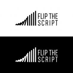
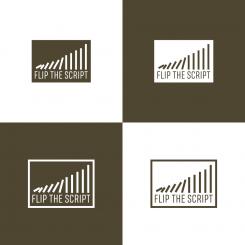
Looking at the position of the logos you made, the upper one here appeals to me the most. Because there is no square around it (I like it better without a square) and the stones could flip the word 'flip the script'. The last stone is just standing still now and I would like to see the last largest stone moving in the logo as well. Combined with the feedback at the other logo about movement, size of stones and vibrancy. Thank you very much for participating!
-
This contest is finished. Its not possible to reply anymore.
-
-
-
estherteunissen says :
Thank you! The simplicity in the logo appeals to me. As for the stones, each subsequent stone may be 1.5 times the size of the previous one. And we would love the first stone to be very small. So the difference in size between the first and the last stone in the logo is quite large. This symbolizes the fact that even with a very small first step, you can set big changes in motion. Although the simplicity appeals to me, the logo itself may feel more vibrant. That there is more sense of movement and power in it. Less static and more organic.
-
estherteunissen says :
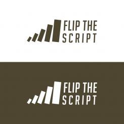
Right now, we think the top logo of this is the best so far.We like the composition and the font. Could you adjust the following:
The first stone should be very small (smaller than now). The space between the stones and the width of the stones is good (in the other variant they are thicker and we don't like that). The difference between the smallest stone and the big stone should be bigger/dramatic (see attachment for inspiration). Each subsequent stone should be 1.5 times as large as the stone before it.
And would you like to play with colors a bit? -
This contest is finished. Its not possible to reply anymore.
-

