deelco, international, business development, consulting
Contest details:
- Contest holder: info@deelco.com
- Category: Logo design
- Total budget: € 75.00
- Start date : 06-05-2012 17:49
- Ending date : 20-05-2012 17:43
- Status : Ended
- Required formats: jpg,psd,aipng
- Relevant files: None
-
Available languages:


- Number of designs: 74
-
Response rate:
low high
Needs:
Company description:
deelco is a young and dynamic company involved in international business development (consulting).
Keywords :
Europe
Asia
Worldwide
Global
Business Development
Business Consultant
Business Development Consultant
International business
International Business Consultant
Synergy
Management
Marketing
Network
Consultancy
Consultant
Opportunity
Target group:
logo to be used on business card (main goal)
As Customer you can consider:
- international operating businesses
- aviation industry
- investors
- entepreneurs
- governments
- lobyists
Colors, favourites and other requirements
Colors: Red, Blue (& white), or any other color that adds to the logo
Looking for a modern, clean, professional and luxery logo.
Ryde Style
-
-
Description by designer Ryde Style:
Hope this is the one...:-)
V1: Darker blue, integrated globe
V2: Lighter blue, globe offset from the triangles.
BR
Jeff | Ryde Style -
This contest is finished. Its not possible to reply anymore.
-
-
-
Description by designer Ryde Style:
Like this...? Logo is on top and bottom aligned with the text, looks better.
-
info@deelco.com says :
thanks, no that is not what I meant, I was afraid it is hard to explain. Think of cutting a square from corner to corner, so you have 2 triangles instead of 2 rectangles (which you have now). Does that make sense?
-
This contest is finished. Its not possible to reply anymore.
-
-
-
Description by designer Ryde Style:
Dear Deelco,
New/improved logo; Lighter blue and the lower/right quarter of the planet.
Looking forward to get feedback
BR
Jeff -
info@deelco.com says :
Thanks Jeff, Very Nice. lower quarter of the globe is ok. Can you adjust the 4 sides of the "square" by cuting them in half. may be difficult to explain, but for example on the left red "square" cut in half from top to bottom and remove the left side. if you do this for all 4 sides, you have more or less 4 triangles, pointing more sharply from left botom to right top (hope this makes sense to you, I did some expirementing myself, so I have a sample but don't know how to send it to you.
-
This contest is finished. Its not possible to reply anymore.
-
-
-
Description by designer Ryde Style:
Dear Deelco,
Thanks for the rating as well as the good feedback.
I changed the font; Less square but still very strong, dynamic, unique and professional.
The payoff is written in a neutral font.Otherwise is will be too much.
Colour blue is a bit more bright.
Good to read from a distance and clear in b/w as well.
PS: If your main market is Asia we can consider to use the lower right quarter of the planet...
Looking forward to receive feedback.
br
Jeff -
This contest is finished. Its not possible to reply anymore.
-
-
-
Description by designer Ryde Style:
2nd option,
quarter planet is integrated into the sqaure.
BR
Jeff | Ryde Style -
info@deelco.com says :
Thanks Jeff, From the 5 options you gave me, I like the quarter planet integrated in the square. The color blue might be a little more bright in characters and square. Different more dynamic type of characters like MariaLouise or Orange Design used. Characters vary thickness like the first 3 options you provided are ok. Change Consultancy by Business Development. Thanks and regards, deelco
-
This contest is finished. Its not possible to reply anymore.
-
-
-
Description by designer Ryde Style:
Dear Deelco,
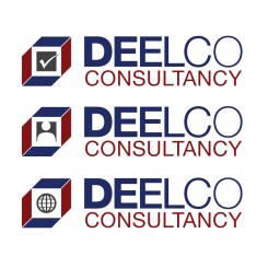
Hereby my three logo proposals; A serious logo with a dynamic touch (Charachters vary in thickness)
I made 3 options for the icon:
1: control/check/advise
2: advise/involve humans
3: operating worldwide.
Looking forward to receive feedback
Best regards,
Jeff | Ryde Style
-
This contest is finished. Its not possible to reply anymore.
-

