Creation of a logo for a crossfit studio, yoga and nutrition
Contest details:
Bronze
- Contest holder: AlexetJL
- Category: Logo design
- Total budget: € 229.00
- Start date : 08-07-2017 00:42
- Ending date : 22-07-2017 00:00
- Status : Ended
- Relevant files: None
-
Available languages:


- Number of designs: 259
-
Response rate:
low high
Needs:
We would like a logo:
- Simple and refined.
- Geometric shape.
- That our customers can identify with this form so some strong thing.
- Easily declinable to use it in all our communication (fly, Facebook etc).
- That one can use the main drawing for each activity without necessarily putting a connotation there.
- Rather tie the design to the initials
Thank you in advance and thank you for all the creations for 6 days which allowed us to finally understand what we wanted.
Company description:
Hello everyone,
We will open a sports complex with two different studios. This complex will be called "Manaia Training or MT" (Manaia = Maori Symbol)
It will host:
- Main activity (50%): A "box crossfit" (exercises with loads + Gymnastic + cardiotraining).
- Secondary activity (very important 30%): A studio yoga.
- Additional activity (20%): Restoration and a dietary pole.
The idea is really to do "gym shops" (specialized fitness) = Clubs in the club.
It will be a dynamic, family, simple company with quality services to offer total support to our customers with very trendy practices.
The main activity will revolve mainly around the crossfit as it will occupy half the premises but yoga will have a predominant part in this project.
Target group:
Colors, favourites and other requirements
artamad
-
-
Description by designer artamad:
14th design, I can only send one last design.
-
AlexetJL says :
It's very nice. If you can do the same design with the good name (new name = Manaia Training) because studio it's too yogi for us. We like this design !
-
artamad says
Hello, could you rate 0 on the other design without your comment. So i can delete them. I can only send one last revision, cause all the revisions you wanted.have your comments now
-
AlexetJL says :
We prefer the design of the one just before. Thinner, more subtle.
-
AlexetJL says :
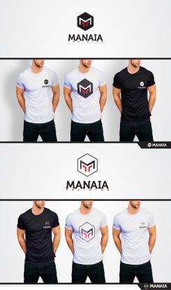
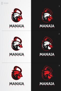
Can you put the first one or the third on a t-shirt please ?
-
artamad says
Revision submitted
-
This contest is finished. Its not possible to reply anymore.
-
-
-
Description by designer artamad:
Updated version, please reply on the other images, so I can delete the ones with 0 rating and no comments. Thanks!
-
artamad says
Any updates?
-
artamad says
Hello? Can I delete this now?
-
MiliG says
Let it be there it looks good ... LOL
-
AlexetJL says :
Hello and sorry to answer only now. Your design is fine but unfortunately our future customers as well as our family does not cling with this style eventually. That's why we went back on a much simpler design. Thank you again for your work.
-
artamad says
no prob, will send a few mock ups later.
-
This contest is finished. Its not possible to reply anymore.
-
-
-
Description by designer artamad:
I can only send 1 last design. Please rate 0 on the designs you dont like and has no comment. So I can delete them for space. I can only send 15 designs limit, this is the 13th design. Please rate 0 on the designs you dont like so I can send more later
-
AlexetJL says :
ok i have done that.
-
artamad says
Any changes on this design?
-
AlexetJL says :
The first one is very nice.
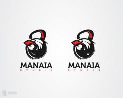
I think this eagle drawing is not the best but the full logo is top. Rather turn the eagle in the other direction to the right so that it looks towards the future. -
AlexetJL says :
I answer here for the last design. I think if you can mix the eagle and the design with the last two design it's perfect. Not with the ying yang in back.
-
artamad says
Mix the new eagle with the last two design?
-
artamad says
Any updates on the recent design? Do you just need two colors? Or I can add a new color?
-
This contest is finished. Its not possible to reply anymore.
-
-
-
AlexetJL says :
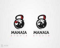
Sorry for my explanations. It would be necessary to keep the model of previous drawing by retouching the beak so that it leaves the kettlebell like the nose of the bull. And just turn the head so that the eye takes the place of the white point of the ying. -
AlexetJL says :
Sorry for my explanations. It would be necessary to keep the model of previous drawing by retouching the beak so that it leaves the kettlebell like the nose of the bull. And just turn the head so that the eye takes the place of the white point of the ying. -
AlexetJL says :
Can you put the white point into the eagle eye
With the first logo
Keep the same eagle as first but with a large nose -
This contest is finished. Its not possible to reply anymore.
-
-
-
AlexetJL says :
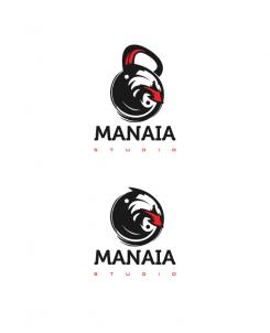
The idea of the head of the eagle in the kettlebell is really top with the ying / yang. The design of the eagle may be too minimalist and it is difficult to see it. Can be balance the yin / yang by taking into account a part with the eye of the eagle -
AlexetJL says :
Reassemble the head of the eagle as on the logo thorus. -
AlexetJL says :
Rework the appearance of the eagle. -
This contest is finished. Its not possible to reply anymore.
-
-
-
artamad says
This one better than the old one?
-
AlexetJL says :
Yes sure ! it's very nice.
-
artamad says
Do you need any other changes? Can you rate 0 on the ones you dont like so I can delete them again :)
-
AlexetJL says :
We like this logo very much but by showing it to prospective customers, there was not the same enthusiasm. They can not identify with this drawing. So we will think. Thank you very much.
-
AlexetJL says :
If ever you still want to suggest something. We just discussed it is possibly to leave in this style of logo but with in main image an eagle (whole or that the head) which I think will allow the members to identify themselves fully. A bit like in my attachments for the THORUS logo. -
AlexetJL says :
or a thorus instead of eagle
-
This contest is finished. Its not possible to reply anymore.
-
-
-
artamad says
Do you like the red version of this? If not please reply here so I can delete it :)
-
AlexetJL says :
not really. thanks
-
This contest is finished. Its not possible to reply anymore.
-
-
-
artamad says
Do you need more changes?
-
AlexetJL says :
I don't know. It's the best since the beginning but i don't know if it's enough strong and representative for crossfit. It's difficult to say what can you change because it's very nice.
-
AlexetJL says :
Maybe keep this design but can be integrate it into a stronger shape to really orient it logo crossfit more than yoga
-
AlexetJL says :
https://www.google.ca/search?q=le+kub3&source=lnms&tbm=isch&sa=X&ved=0ahUKEwjkw72Gwv_UAhUJOz4KHUMhAPQQ_AUIBigB&biw=1340&bih=706#tbm=isch&q=logo+crossfit&imgrc=_
-
AlexetJL says :
I think our logo is between this one and that of alex sonnet. -
artamad says
Do you need other changes on this? I have a recent design, leme know if you like anything on that. Font/design/presentation or anything :)
-
This contest is finished. Its not possible to reply anymore.
-
-
-
AlexetJL says :
In red and black it's possible ?
-
This contest is finished. Its not possible to reply anymore.
-
-
-
artamad says
Do you like this? Or do you need something else?
-
AlexetJL says :
It is very good but when I see this logo I understand that it is essentially yoga with a little part of strenght and we want the opposite. Crossfit it's a big part in our project. thank you so much for your hard work. -
This contest is finished. Its not possible to reply anymore.
-
-
-
AlexetJL says :
It's very good, but a little bit too "yogi" for me. We don't see the crossfit part. thank you.
-
This contest is finished. Its not possible to reply anymore.
-
-
-
AlexetJL says :
On ne comprend pas la signification de la forme si il y en a une... Merci.
-
This contest is finished. Its not possible to reply anymore.
-

