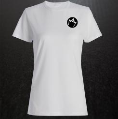
Creation of a logo for a crossfit studio, yoga and nutrition
Contest details:
Bronze
- Contest holder: AlexetJL
- Category: Logo design
- Total budget: € 229.00
- Start date : 08-07-2017 00:42
- Ending date : 22-07-2017 00:00
- Status : Ended
- Relevant files: None
-
Available languages:


- Number of designs: 259
-
Response rate:
low high
Needs:
We would like a logo:
- Simple and refined.
- Geometric shape.
- That our customers can identify with this form so some strong thing.
- Easily declinable to use it in all our communication (fly, Facebook etc).
- That one can use the main drawing for each activity without necessarily putting a connotation there.
- Rather tie the design to the initials
Thank you in advance and thank you for all the creations for 6 days which allowed us to finally understand what we wanted.
Company description:
Hello everyone,
We will open a sports complex with two different studios. This complex will be called "Manaia Training or MT" (Manaia = Maori Symbol)
It will host:
- Main activity (50%): A "box crossfit" (exercises with loads + Gymnastic + cardiotraining).
- Secondary activity (very important 30%): A studio yoga.
- Additional activity (20%): Restoration and a dietary pole.
The idea is really to do "gym shops" (specialized fitness) = Clubs in the club.
It will be a dynamic, family, simple company with quality services to offer total support to our customers with very trendy practices.
The main activity will revolve mainly around the crossfit as it will occupy half the premises but yoga will have a predominant part in this project.
Target group:
Colors, favourites and other requirements
Brugha
-
-
Brugha says
Merci pour vos étoiles ! Le côté sport ressort à travers l'énergie du logo, et pour la déclinaison "yoga", le triangle rappelle la posture du lotus. Je vais essayer de retravailler au mieux ;) Cordialement.
-
This contest is finished. Its not possible to reply anymore.
-
-
-
Description by designer Brugha:
Le logo est inspiré par la feuille d'érable du drapeau canadien qui forme ici le M (et avec option une déclinaison avec le triangle représentant le a: manaia), puissant qui s'élève vers la droite, symbolisant une couronne (pouvoir, volonté, puissance) et/ou un éclair (énergie, effort physique. La police est clair et précise, avec le "o" qui peut reprendre le logo éventuellement.Disponible tous coloris.
-
AlexetJL says :
Il y a de l'idée dans l'explication et la création mais on ne retrouve pas trop le coté sport.
-
This contest is finished. Its not possible to reply anymore.
-


